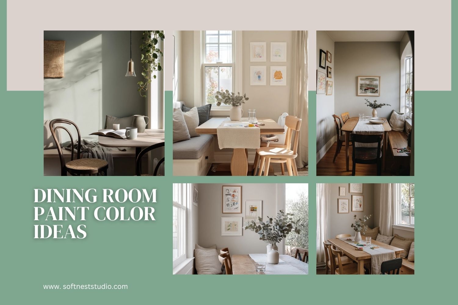
Choosing dining room paint color ideas can feel hard because the room has to do many jobs. It is where you eat, help with homework, and gather with friends. The right wall color helps the space feel calm, bright, and easy to live in.
This guide shares 10 paint colors inspired by real dining spaces, like warm greige, muted sage, moody clay, and deep navy. Each idea includes simple styling tips you can copy with common pieces like an oak table, mixed chairs, a linen runner, and a ceramic vase.
You will also see what to pair with each color, from brass pendants to woven blinds and vintage rugs. If you rent, there is a renter-friendly accent wall idea, too.
Use these ideas to pick a shade that works with your light, your furniture, and your daily messes. Small changes like art placement, lighting, and textiles can make the color look better without a full makeover.
Intro H2: 1. Warm Greige Dining Nook Paint Color

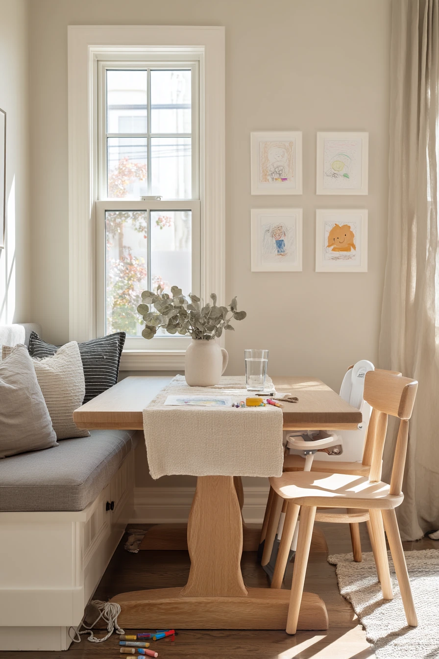
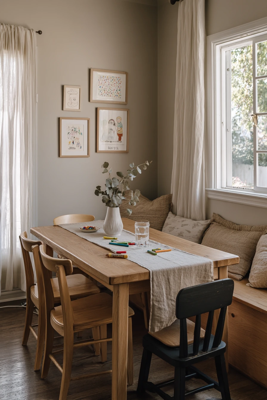
Warm greige is a go-to dining room paint color when you want the space to feel soft but not bland. It sits between beige and gray, so it works with many wood tones. In a real family dining nook, greige walls make an oak pedestal table look warmer and help mixed wood chairs feel like they belong together.
This shade is also forgiving with everyday life. Condensation on a water glass, a charging cable near the bench, and a few crayons on the floor do not fight with the calm background. Add a linen runner and a ceramic vase with eucalyptus for simple texture that still looks neat most days.
To style it, hang framed kids’ drawings in matching frames so the wall looks tidy, even if the art changes. Keep the tabletop mostly clear, then add one small “anchor” item like a bowl or vase. If you have a high chair, tuck it to the side and use a bench on the other side to save space.
- Pick a greige with warm undertones so oak and walnut do not look dull.
- Layer natural fabrics like linen or cotton to keep the room cozy.
- Use black or bronze hardware and frames to add contrast.
- Add one green plant or eucalyptus stems for a fresh touch.
- Choose washable paint in an eggshell finish for easy wipe-downs.
Pro Design Tip: Test greige on two walls, then check it in morning and late afternoon light, because it can shift from warm to flat depending on the window direction.
Budget Considerations: If repainting the whole room is too much, paint just the nook wall behind the table and keep the rest a simple warm white.

Intro H2: 2. Muted Sage Dining Corner Paint Color

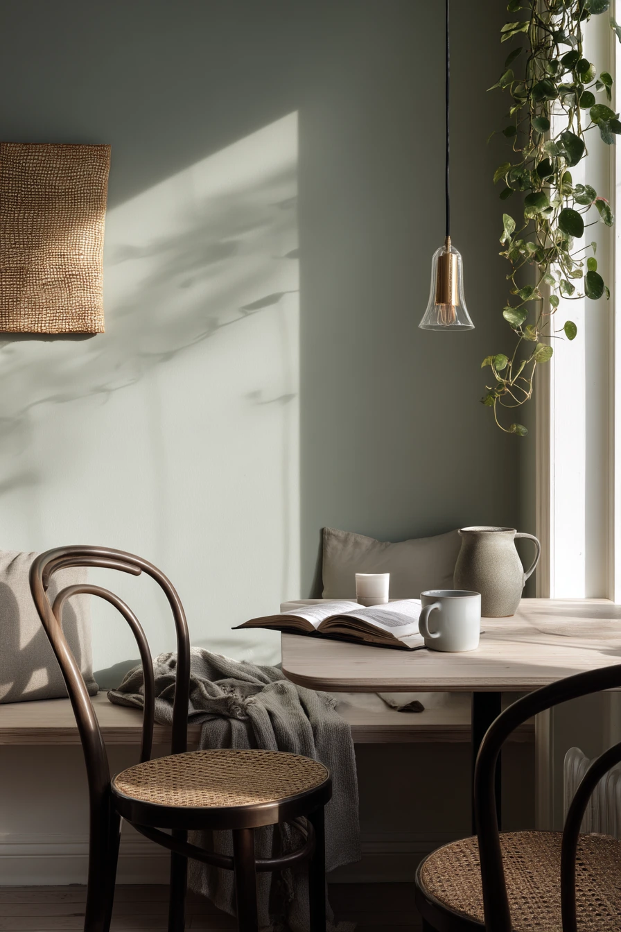
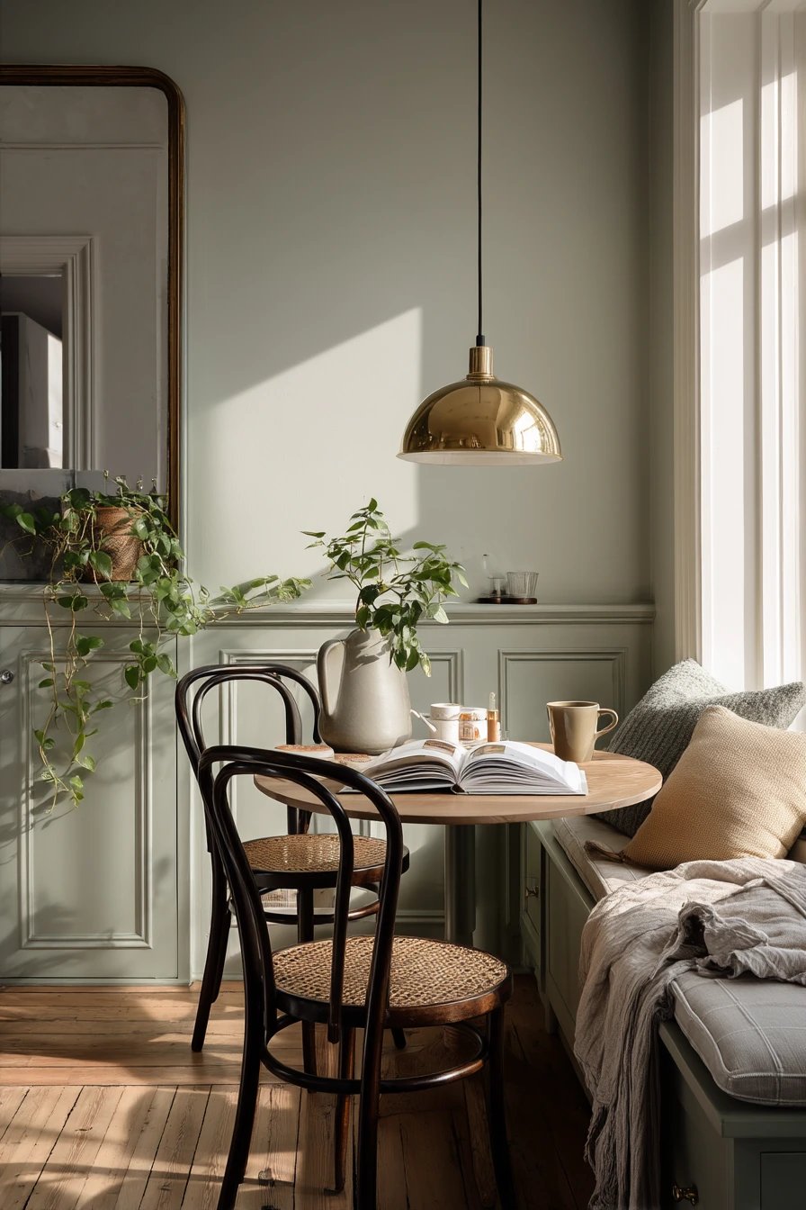
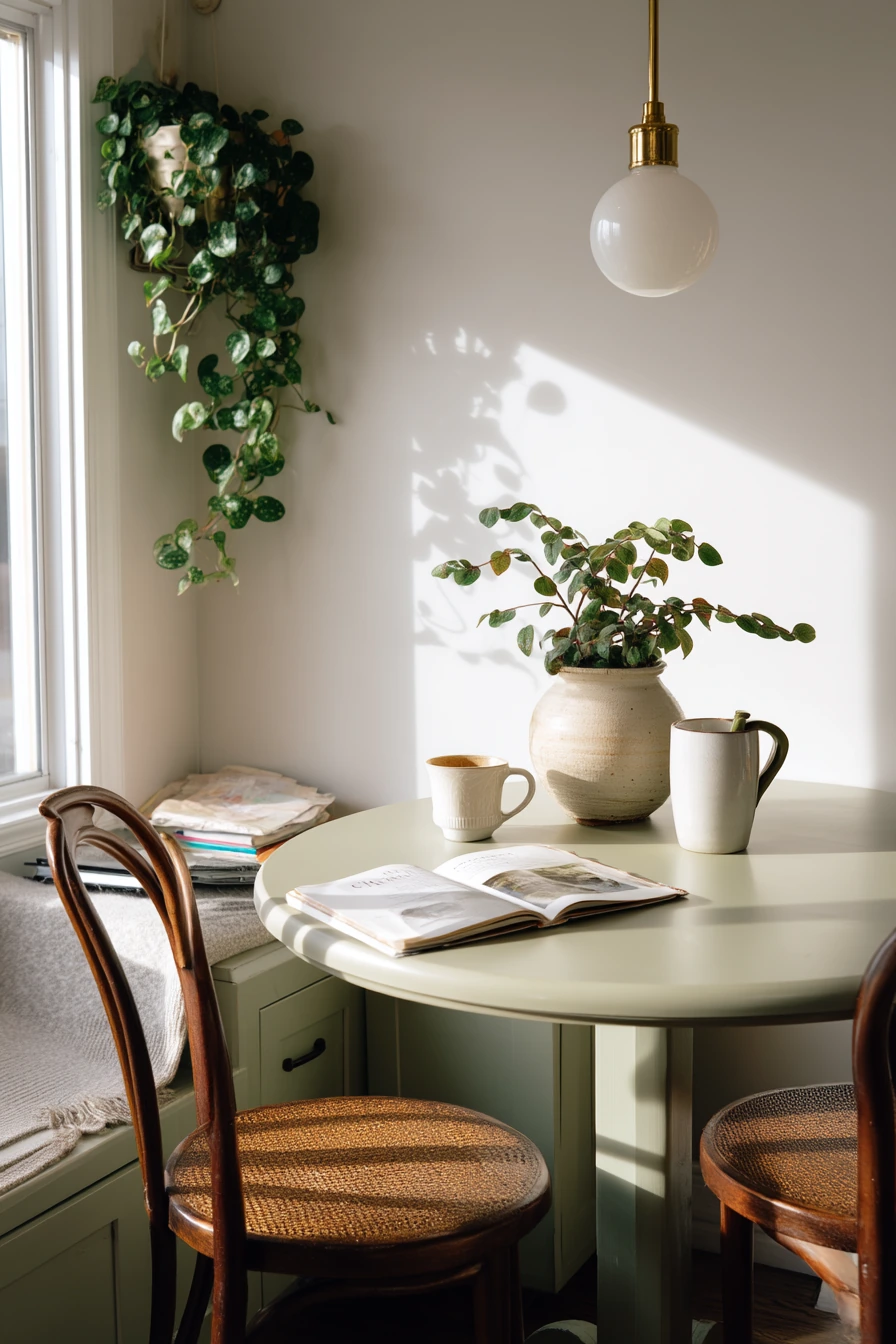
Muted sage is a smart dining room paint color for small apartments because it adds color without making the corner feel busy. It reads calm, especially with soft morning window light. With a compact round table and two bentwood chairs, sage helps the setup feel planned, not squeezed in.
This color pairs well with warm metals, so a brass pendant looks rich but still relaxed. A slim wall mirror helps bounce light and makes the corner look larger. Keep stoneware simple and let one trailing pothos create natural shadow and movement.
For a lived-in look that still feels clean, corral mail in a tray on the sideboard and keep a small stack of cookbooks together. If you use a bench, add a slightly wrinkled throw in a solid color so it feels cozy, not messy. One mug left half-finished is normal, so focus on keeping the rest of the surfaces clear.
- Choose a sage that leans gray for a softer, less “green” look.
- Pair with light wood and bentwood chairs to keep it airy.
- Use brass or warm gold lighting to balance the cool wall tone.
- Add a mirror to reflect daylight and open up the corner.
- Style with one trailing plant and a neutral table runner.
Pro Design Tip: Use the same sage color on nearby trim or a small shelf to make the dining corner feel like a real zone, not an afterthought.
Budget Considerations: A plug-in pendant or a thrifted brass-style light can give the same vibe as hardwired fixtures for less.
Intro H2: 3. Moody Clay Dining Room Paint Color


Moody clay walls are a strong dining room paint color idea when you want the room to feel grounded and intimate. Clay tones sit between terracotta and brown, and they look rich in warm lamp light and dusk. They also make dark walnut furniture look deep and classic.
In a dining room with upholstered chairs, abstract art, and a vintage rug, clay paint pulls everything together. It softens the contrast between dark wood and lighter decor like a low ceramic bowl or candlesticks. Lived-in items like reading glasses, a folded napkin, and a remote control can stay out without looking harsh against the walls.
To style this color, focus on texture. Add a rug with a worn pattern, linen napkins, and matte ceramics. Use a narrow console with books to keep the room useful and prevent clutter on the table. If the space feels too dark, add one larger mirror or a lighter art mat to lift the look without changing the paint.
- Pick clay with a little red to keep the room warm, not muddy.
- Use warm bulbs in lamps to make the wall color glow.
- Balance dark furniture with light upholstery or a lighter rug.
- Keep decor low on the table so the room feels open.
- Add simple black frames to sharpen the look around art.
Pro Design Tip: Layer lighting at two heights, like a pendant plus a table lamp on a console, so the clay color looks even and not shadowy.
Budget Considerations: If new upholstered chairs are not in the plan, use chair pads and slipcovers in a light neutral to balance the darker walls.


Intro H2: 4. Soft Blue-Gray Breakfast Room Paint Color
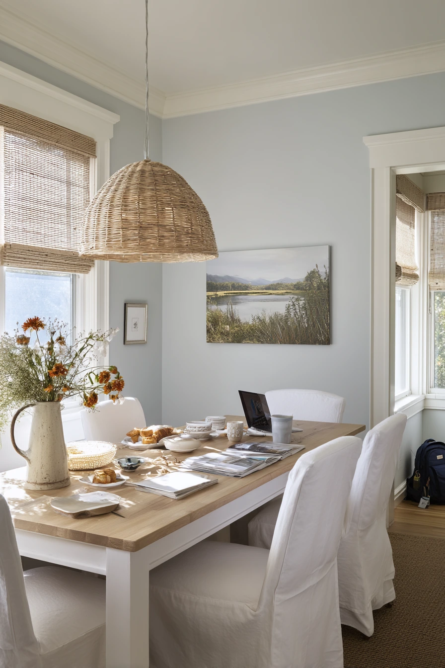

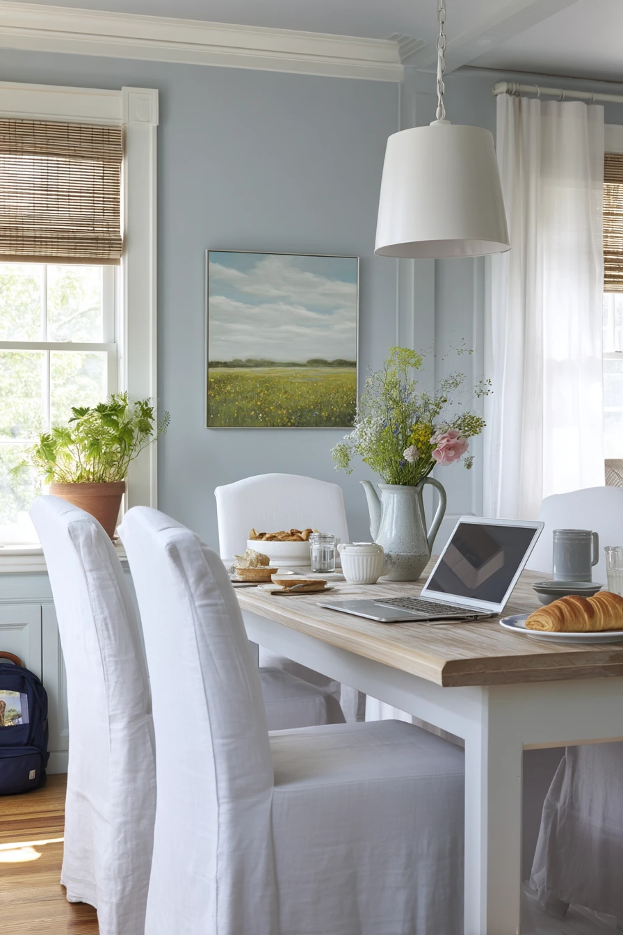
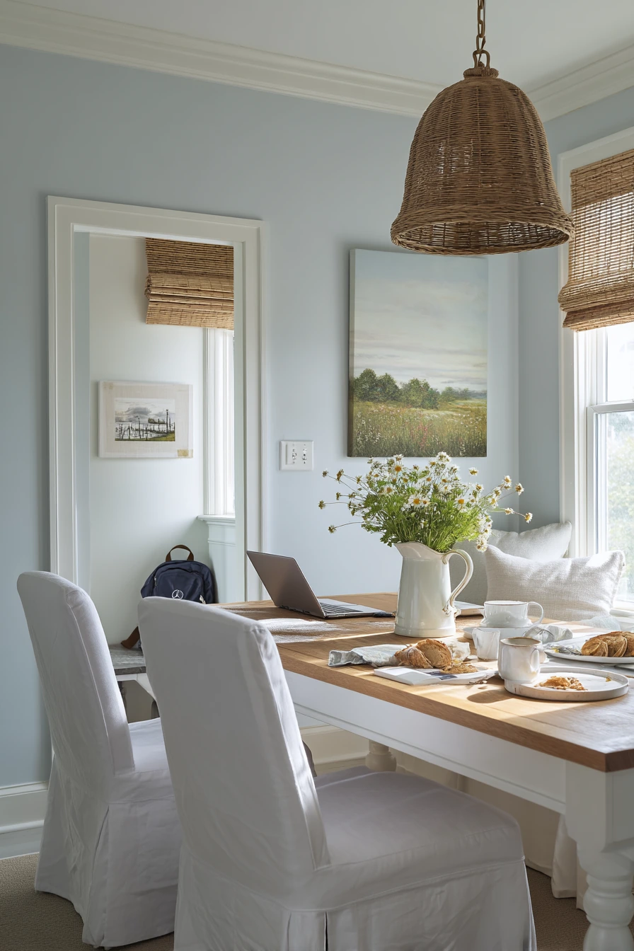
Soft blue-gray is a clean dining room paint color for a bright breakfast room. It feels crisp but gentle, especially in late-morning window light. With a pale oak table and white slipcovered chairs, this shade gives you a fresh look that still feels relaxed for daily use.
This color works well with woven blinds and simple pendants because it likes natural textures. Add an enamel pitcher with wildflowers for a small pop that does not take over the room. A framed landscape print adds a calm focal point and helps the wall color look intentional.
Real life shows up here, like a half-open laptop, toast crumbs, and a kid’s backpack by the wall. Blue-gray handles these cues well because it is not too warm or too stark. Style the space by keeping one “drop zone” basket for backpacks, and use a wipeable placemat setup for quick cleanups. If you want more warmth, add a tan runner or a small vintage-style rug.
- Choose a blue-gray with a touch of warmth so it does not look icy.
- Pair with white slipcovers for an easy, washable look.
- Add woven blinds to bring in texture and soften the light.
- Use simple art like landscapes to keep the room calm.
- Mix in light wood accents to prevent a cold feel.
Pro Design Tip: Match your white trim and slipcovers first, then pick the blue-gray so the whites do not look yellow next to the paint.
Budget Considerations: Slipcovers can cost less than new chairs, and many are machine washable, which saves money over time.
Intro H2: 5. Terracotta Accent Wall Dining Room Paint Color (Renter-Friendly)
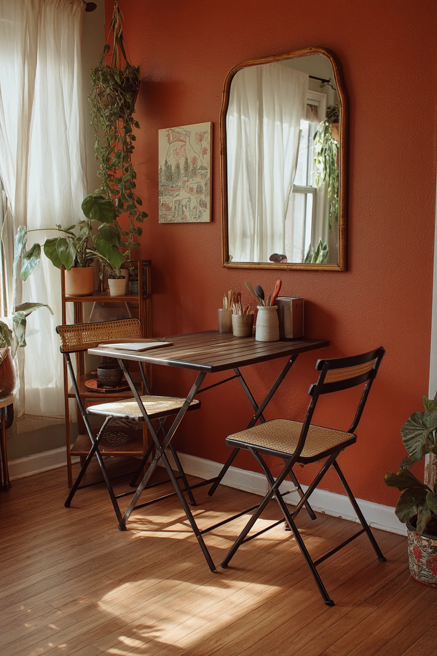

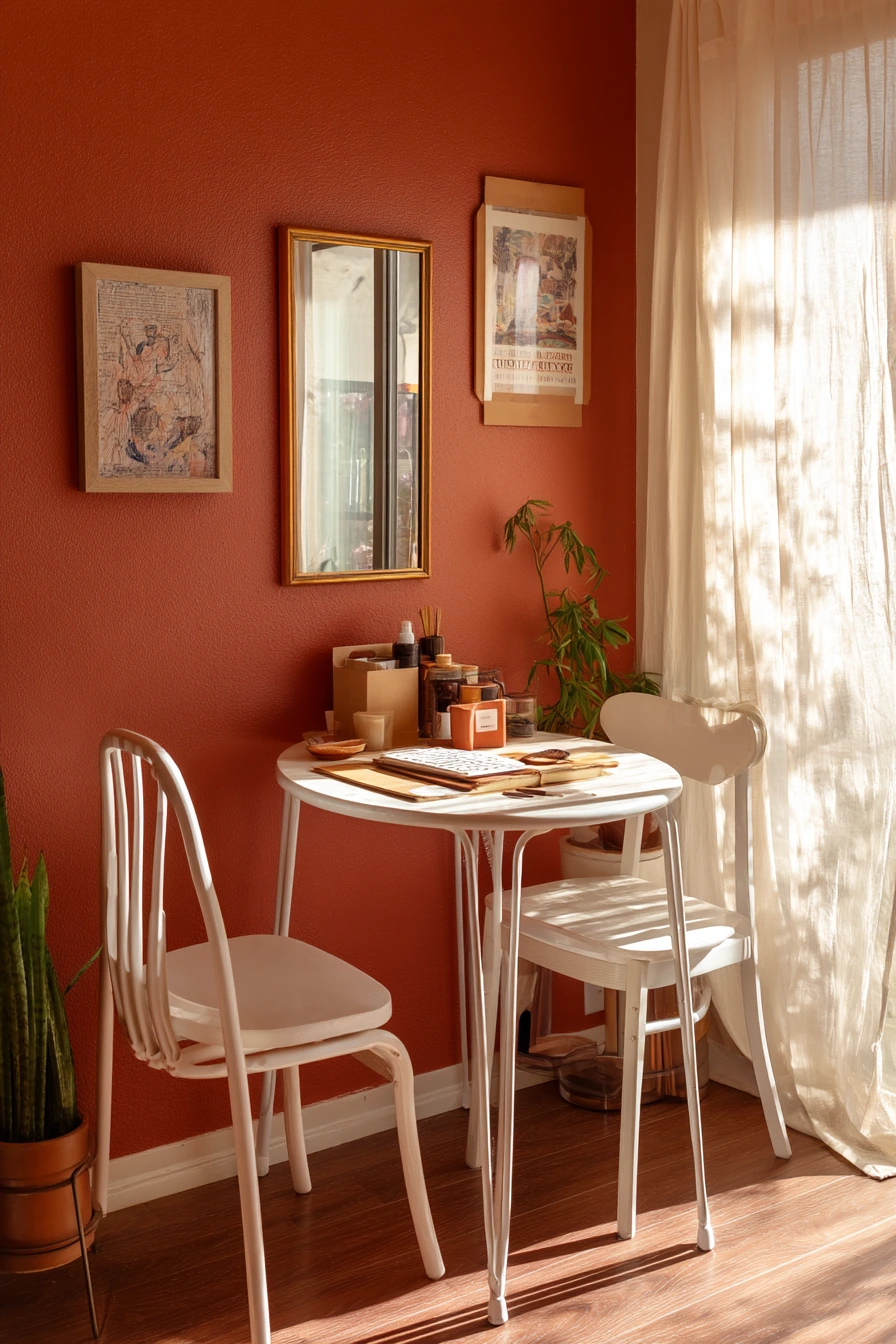
A terracotta accent wall is a renter-friendly dining room paint color idea that adds warmth fast. It feels earthy and playful, and it looks great in warm afternoon light through sheer curtains. With a compact café table and stackable chairs, this setup stays flexible for small spaces.
Terracotta pairs well with thrifted decor, like a mirror with a worn frame or a simple plant stand. If you cannot use nails, choose removable artwork and picture ledges. The color also works with everyday details, like a box of takeout chopsticks, a folded market tote, and pencil marks on a notepad, because it has a casual, welcoming feel.
To style it, keep the rest of the room simple. Use light neutrals on nearby walls and choose table settings in stoneware, cream, or soft gray. Add one green plant to balance the orange tone. If the wall feels too bold, break it up with a large mirror or a gallery of small frames in the same finish.
- Use terracotta on one wall to keep the room from feeling smaller.
- Pair with light woods and black accents for a modern look.
- Choose removable hooks and frames for renter-safe art.
- Add greenery to cool down the warm wall color.
- Keep chairs stackable so the space can change fast.
Pro Design Tip: Place the accent wall behind the table when possible, so the color reads like a backdrop and the rest of the room stays calm.
Budget Considerations: Peel-and-stick wallpaper in a terracotta tone can mimic paint and is easier to remove when you move out.

Intro H2: 6. Creamy White Dining Room Paint Color with Trim


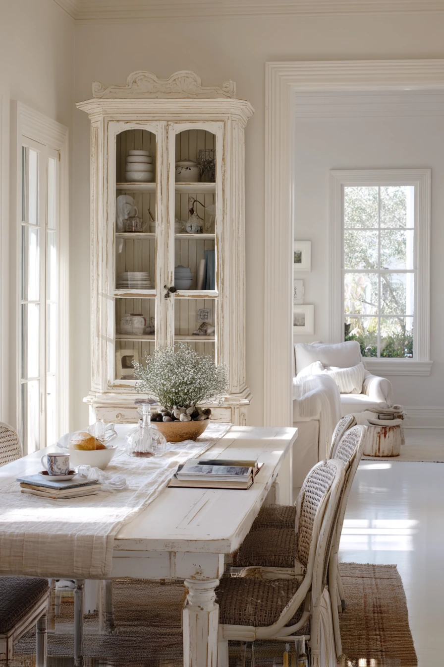
Creamy white is a classic dining room paint color that makes the room feel luminous and serene. It is softer than bright white, which helps it look gentle with side window light. In a space with layered trim, creamy white highlights the detail without feeling sharp.
This color works beautifully with an antique table, rattan-backed chairs, and a pleated linen shade. A glass-front cabinet and collected ceramics add interest without needing bold paint. Even lived-in signs, like a tea cup ring on a saucer, an open recipe book, and a dog bowl near the doorway, blend in and still look calm.
To style creamy white, use contrast on purpose. Add a faded runner, darker wood tones, and a few black or bronze accents to keep the room from feeling plain. Group ceramics by color family so shelves look tidy. If you cook often, keep a small tray for recipe books and a catchall bowl so the table stays ready for meals.
- Pick a creamy white that matches your flooring undertone.
- Use trim and paneling to add depth without adding color.
- Bring in texture with rattan, linen, and aged wood.
- Display ceramics in small groups for a collected look.
- Add a runner or rug to protect floors and soften sound.
Pro Design Tip: Use two sheens of the same creamy white, like satin on trim and eggshell on walls, to make the trim detail stand out quietly.
Budget Considerations: If new trim is not possible, add stick-on molding or paint existing trim a fresh creamy white for a similar layered effect.

Intro H2: 7. Dusty Plum Dining Room Paint Color
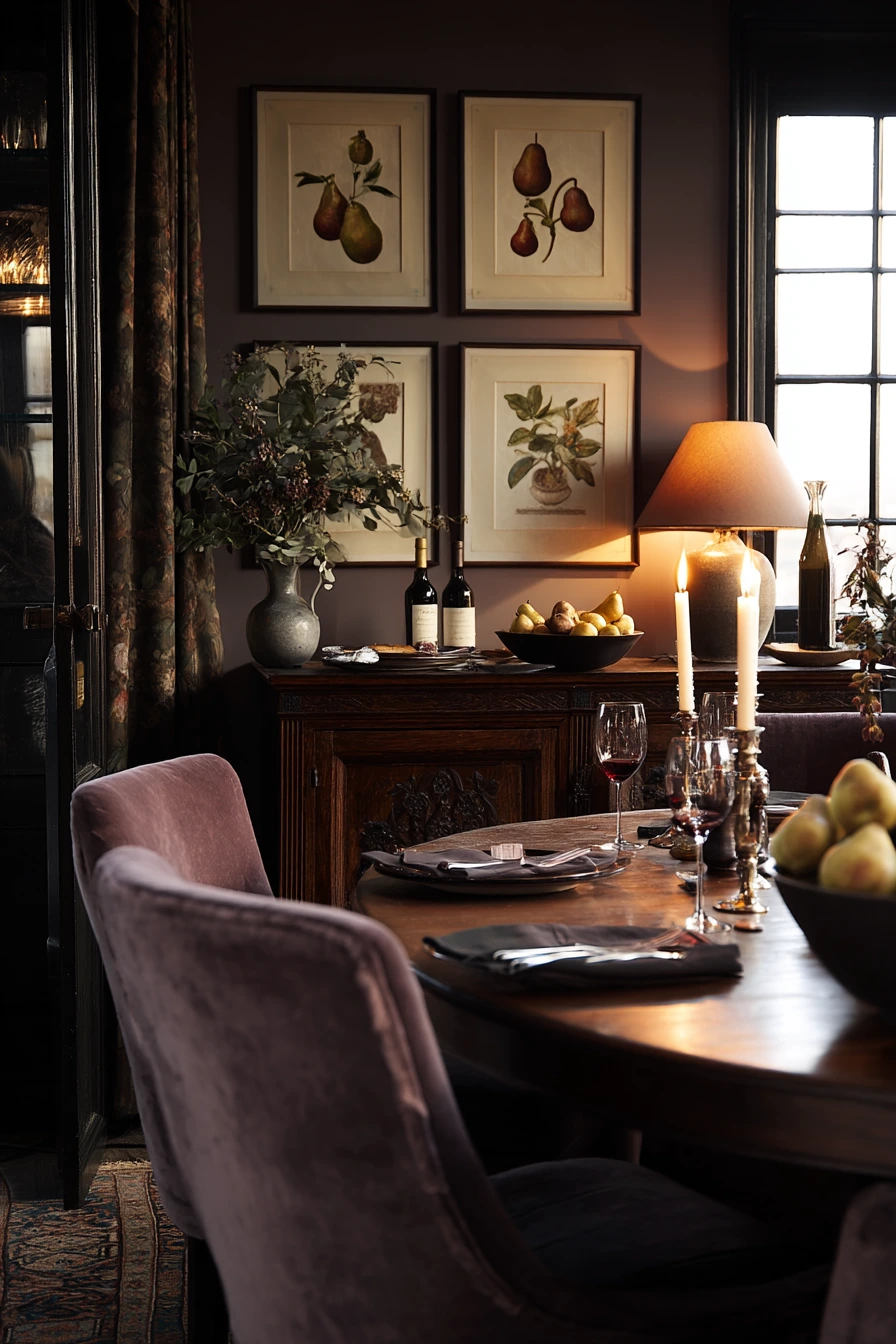
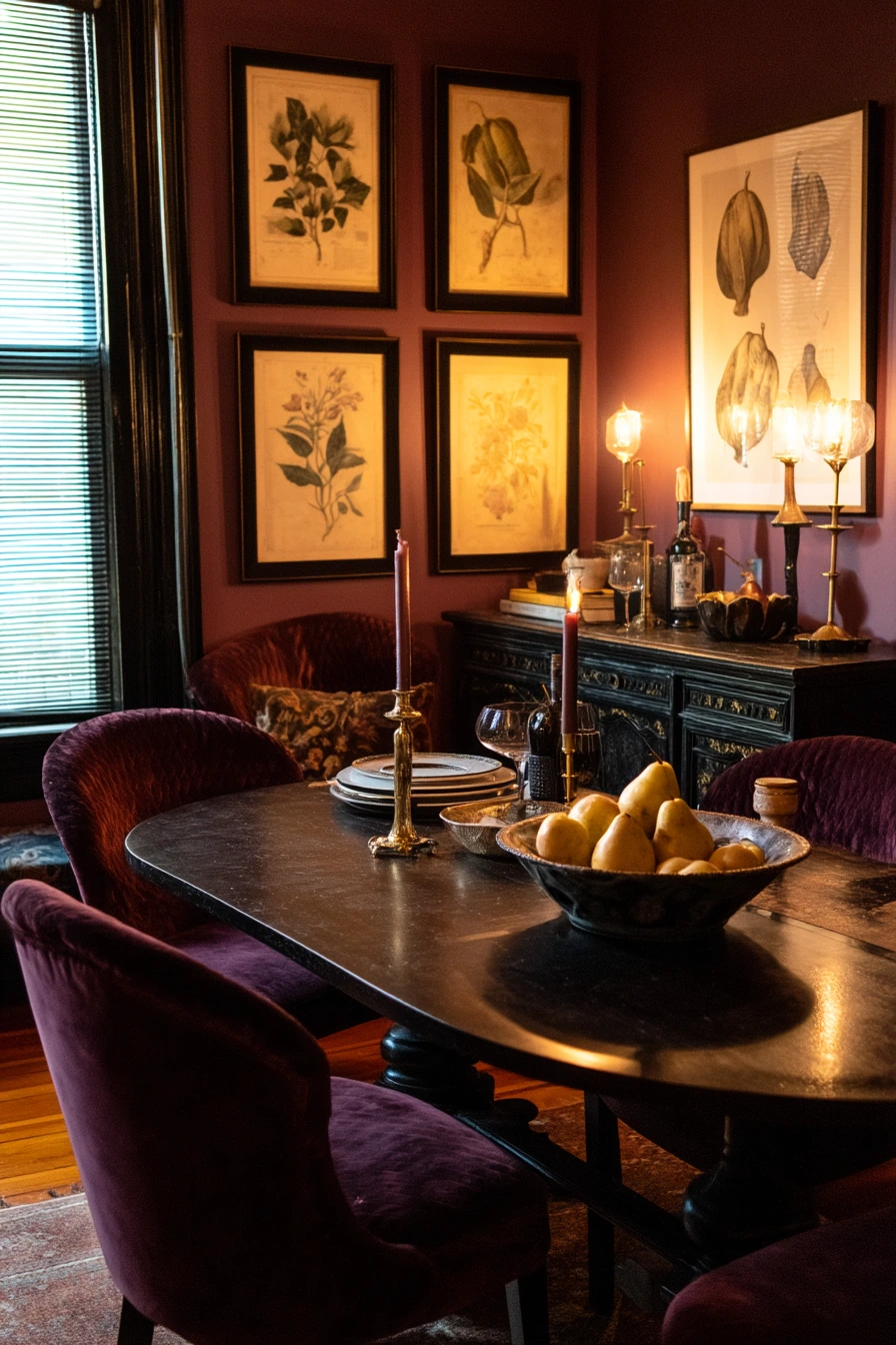
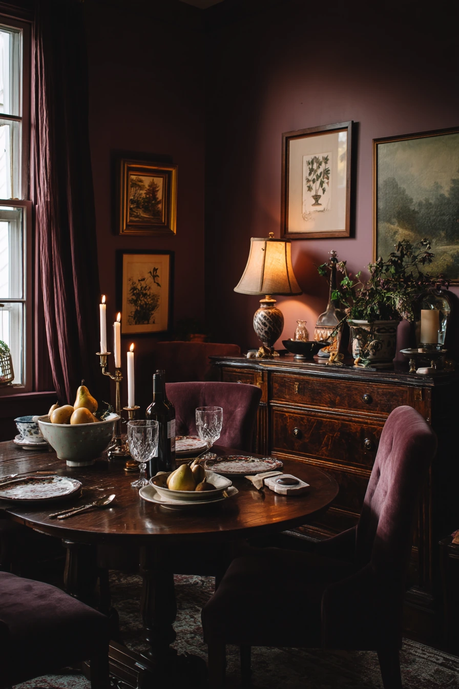
Dusty plum is a bold dining room paint color idea that still feels livable because it is muted. It adds depth and a cocooning mood, especially with warm lamp light and a dim window glow. This color can make an oval table set for four feel like a special spot, even on regular nights.
Plum walls look great with velvet chairs, candlesticks, and framed botanical prints. Dark wood pieces, like a sideboard, feel richer next to this shade. Everyday cues like a wine bottle cork, napkins slightly askew, and a phone charging on the buffet will still look natural, not messy.
To style dusty plum, balance it with lighter items so the room does not feel heavy. Use a light table runner, cream candles, and a bowl of pears or other simple fruit. Choose art with some white space, like botanical prints with pale backgrounds. If you want a cleaner look, keep the tabletop decor to two items and store extras in the sideboard.
- Choose a dusty plum with brown undertones for a softer feel.
- Pair with warm metals like brass for lighting and frames.
- Use velvet or brushed fabrics to match the wall’s depth.
- Lighten the room with cream linens and pale artwork mats.
- Keep decor simple so the color stays the star.
Pro Design Tip: Add a dimmer to your main light so you can shift the plum walls from cozy at night to brighter for daytime meals.
Budget Considerations: Velvet chairs can be pricey; look for slipcovered chairs in a velvety fabric or add plush seat cushions for a similar effect.

Intro H2: 8. Pale Olive Dining Room Paint Color with Nature Views


Pale olive is a peaceful dining room paint color that connects the room to the outdoors. It looks especially good when your windows face trees or a yard. In soft overcast daylight, olive feels fresh and grounded without being too bright.
This shade pairs well with a simple oak table and woven chairs because it plays nicely with natural materials. Add a clay vase, open shelving, and a small stack of gardening books to lean into the relaxed, nature-based look. Lived-in details like muddy boots by the back door, a watering can, and herb clippings on the table fit the story of the space.
To style it, keep your main accents in warm neutrals like cream, tan, and soft black. Use simple dishware and let one or two green plants echo the wall color. If you want the room to feel cleaner, create a small boot tray near the door and use a shallow bowl for herb clippings until you can compost them.
- Choose pale olive with a muted, gray base for a softer look.
- Use woven seating and light wood to keep it airy.
- Style shelves with books and ceramics in small groups.
- Add a boot tray and hooks to control entryway clutter.
- Use matte clay or stoneware to match the natural feel.
Pro Design Tip: Repeat olive in small doses, like a napkin set or a bowl, so the paint looks connected to the rest of the room.
Budget Considerations: Open shelving can be made with basic boards and brackets, which often costs less than a new cabinet.


Intro H2: 9. Deep Navy Dining Room Paint Color for an Elegant Look


Deep navy is a rich dining room paint color idea that can look elegant without feeling stiff. It adds instant depth and makes the room feel quieter and more focused. With brass picture lights, navy walls feel warm and polished, especially with natural afternoon light and one lamp.
This color looks great with a round pedestal table, tailored chairs, and a vintage credenza. A single statement mirror keeps the room from feeling too dark and reflects light back into the space. Lived-in touches, like a folded newspaper, keys on the sideboard, and a barely touched dessert plate, still fit because navy reads classic and steady.
To style navy, keep the top half of the room lighter through art, mirrors, and lighting. Use crisp white or cream linens, and add one warm wood tone to prevent a cold look. If your room is small, focus the navy on the dining area walls and keep adjacent spaces a lighter neutral for flow.
- Pick a navy with a hint of warmth to avoid a harsh look.
- Use brass lights and frames to add glow against the dark paint.
- Add a large mirror to bounce daylight around the room.
- Keep linens light to create contrast and clarity.
- Include warm wood furniture to balance the cool wall tone.
Pro Design Tip: Paint the ceiling a softer off-white, not bright white, so the navy walls feel smoother and less stark at the edges.
Budget Considerations: Picture lights and brass accents can be found secondhand; spray paint can update mismatched metal pieces to a consistent finish.


Intro H2: 10. Warm Mushroom Dining Room Paint Color for Families


Warm mushroom is a practical dining room paint color for busy homes. It is a soft, earthy neutral that feels cozy and works with many styles. In a family dining room, mushroom walls help mixed chairs look intentional and make a rectangular table feel inviting for daily meals.
This shade pairs well with woven pendants and natural textures. Add a ceramic fruit bowl and a bench under the window for a functional layout. Everyday life, like school lunch notes pinned nearby, a spilled napkin, a toy basket half full, and a sweater draped over one chair, blends in because mushroom is forgiving and calm.
To style it, create simple systems. Use a pinboard or small rail for notes so paper does not spread across the table. Keep a lidded basket for toys and a small tray for keys. Add one patterned rug to hide crumbs and add comfort underfoot. If you want more brightness, pair mushroom walls with warm white trim and light curtains.
- Choose mushroom with a warm base so it does not look gray.
- Mix wood tones, but repeat one tone at least twice for balance.
- Use a bench to fit more people and keep walkways open.
- Add woven lighting to soften the room and reduce glare.
- Use baskets and trays to control daily clutter.
Pro Design Tip: Keep high-contrast items, like a black frame or dark bowl, to a few spots so the mushroom color stays the main background and the room feels calm.
Budget Considerations: A simple bench can replace two chairs and often costs less, while also giving you room to slide in extra seating when needed.


The best dining room paint color ideas match your real life, not just a perfect photo. Warm greige and mushroom hide daily wear, sage and olive feel fresh, and clay, plum, and navy bring depth for a cozy mood.
Before you commit, test paint samples in your own light and next to your table and chairs. Then use easy styling moves like a linen runner, simple art, warm lighting, and baskets for clutter.
If you want the fastest change, start with one accent wall or a dining nook area. Small updates can make the whole room feel better without buying new furniture.
FAQ
What is the best paint finish for a dining room? Eggshell is a good choice for most dining rooms. It is easier to wipe than flat paint and hides wall texture better than satin.
How do I choose a dining room color with lots of wood furniture? Start with the undertone of the wood. Warm woods often look best with warm greige, mushroom, creamy white, clay, or terracotta.
Do dark dining room colors make a room look smaller? They can, but dark shades like deep navy or dusty plum can also make a space feel cozy and intentional. Add mirrors, warm lighting, and light linens to keep balance.
What colors make a dining room feel calm? Muted sage, pale olive, warm greige, and soft blue-gray are calming choices. They work well with simple decor and natural textures.
Can I do an accent wall in a dining room? Yes. An accent wall behind the table is a common choice because it frames the seating area and looks like a backdrop for art.
What is a renter-friendly way to add color? Use peel-and-stick wallpaper or paint a single wall if your lease allows it. Pair it with removable hooks and lightweight frames for easy changes.