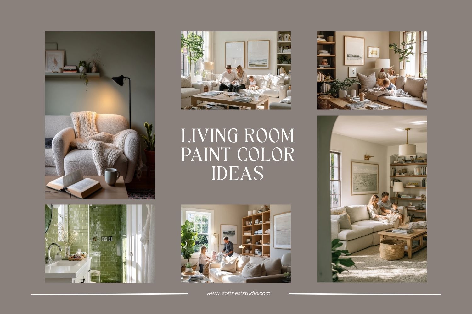
Choosing the right living room paint color can feel hard because the room does a lot. It is where you relax, host friends, and store the everyday stuff like toys, books, and chargers.
This guide shares living room paint color ideas based on real, lived-in rooms. You will see warm greige, soft sage, pale blue, clay beige, charcoal accent walls, dusty pink, deep olive, creamy white, muted terracotta, and soft taupe.
For each color, you will get simple ways to style it, what it pairs well with, and how to keep it looking calm even when life is messy. If you came from Pinterest, you can use these ideas to pick a color that works with your light, your furniture, and your budget.
Each section also includes a Pro Design Tip and a Budget Consideration, so you can get a finished look without overthinking it.
1. Warm Greige Living Room Paint for Real Family Life
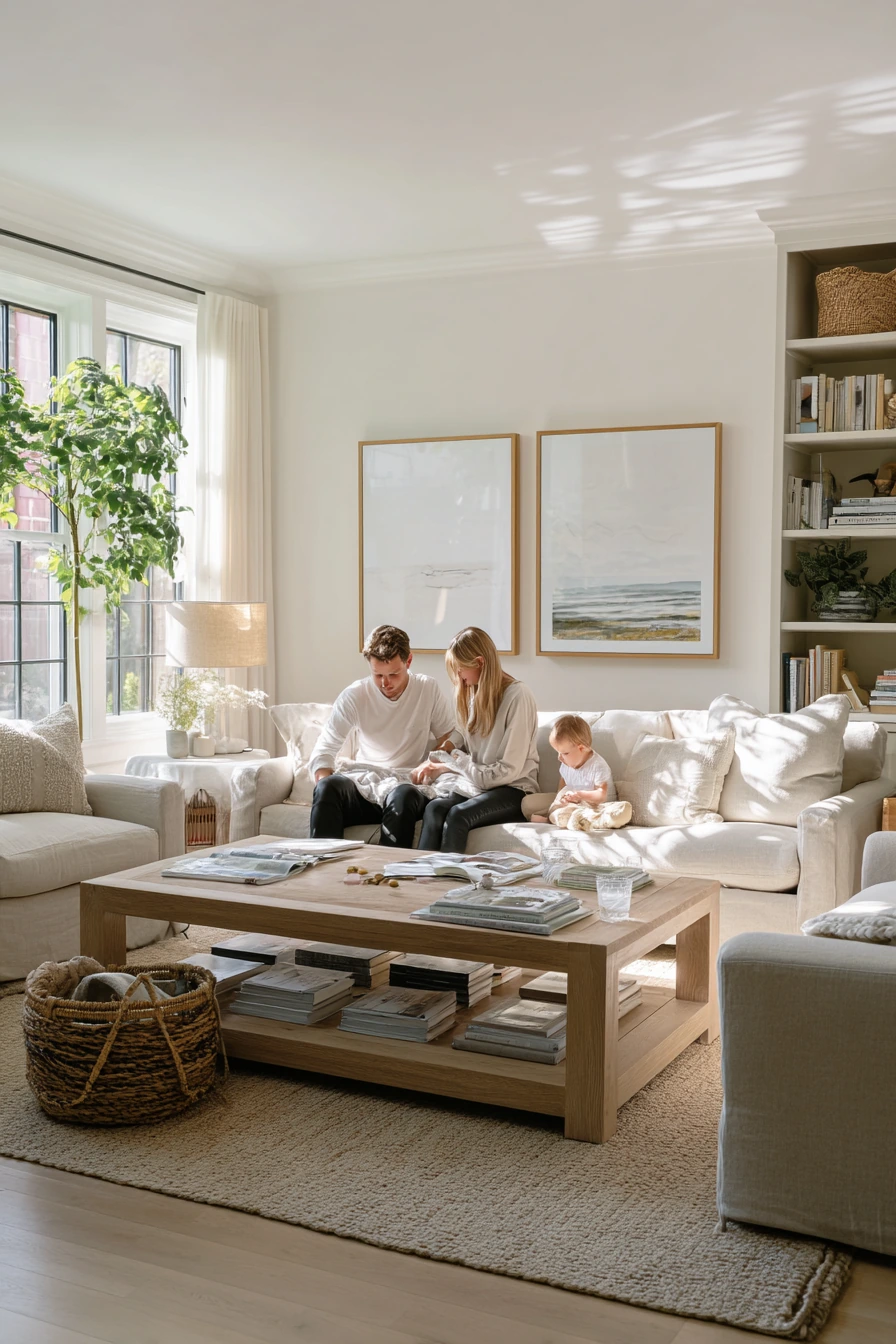
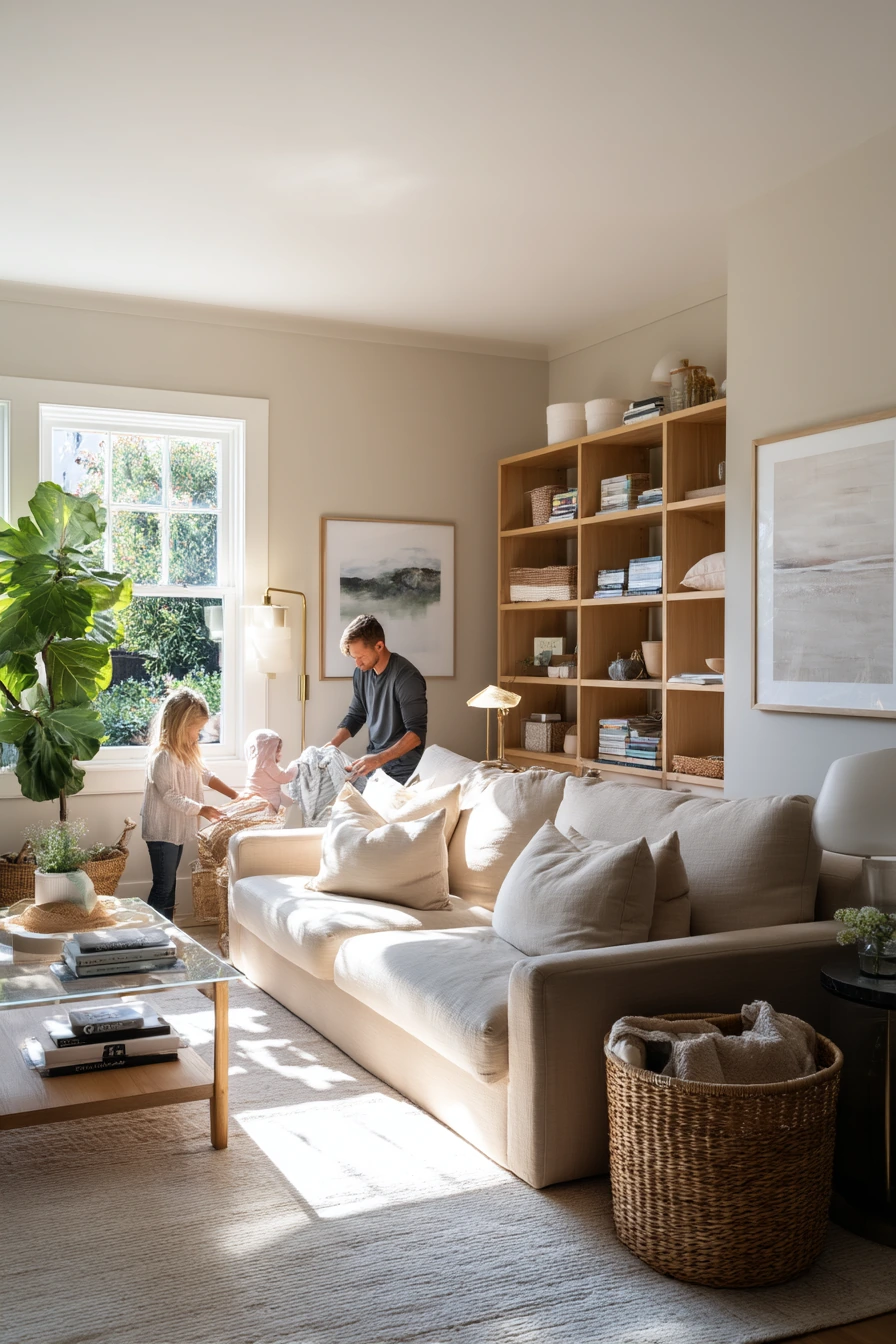
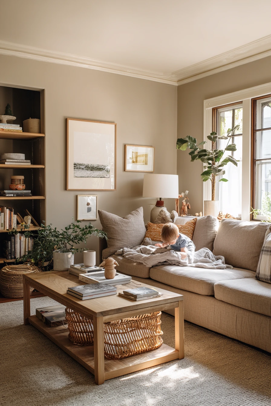
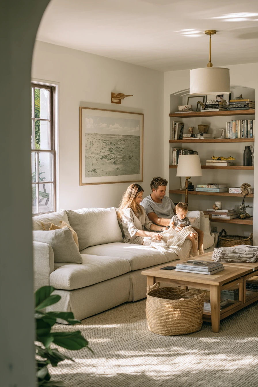
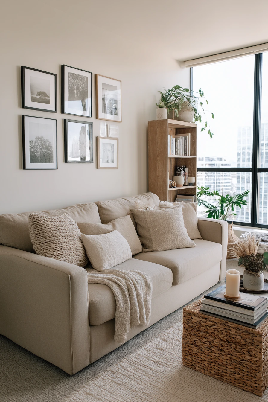
Warm greige is one of the easiest living room paint color ideas for a busy family. It sits between beige and gray, so it hides scuffs better than bright white and feels softer than cool gray. In a real family living room, it makes a linen sofa, woven rug, and soft oak shelving look calm, even with stacked paperbacks, a half-full water glass, and a slightly wrinkled throw.
This color works well in natural window light because it keeps the room warm without turning yellow. It also makes brass details, like a simple floor or table lamp, stand out in a quiet way. Add muted art and let leafy plant shadows fall on the walls for depth that does not feel busy.
To style warm greige, keep textures doing the work. Mix linen, jute, and oak so the room feels cozy, not flat. A toddler toy basket near the coffee table can still look neat if it is woven and has a lid, or if you group it with one other basket to make it feel planned.
- Choose a greige with warm undertones so it looks steady from morning to night.
- Use a woven rug to add pattern without making the space loud.
- Keep shelves simple: books, one plant, and a few matte objects.
- Pick soft black or aged brass for lamps and hardware.
- Use baskets for laundry and toys so everyday items look tidy fast.
Pro Design Tip: Paint a large poster board with your greige sample and move it around the room near the sofa, shelves, and window to check undertones before you commit.
Budget Considerations: Warm greige is common across brands, so you can color match a premium shade into a mid-priced paint line and still get a similar look.
2. Soft Sage Living Room Paint for a Cozy Reading Nook
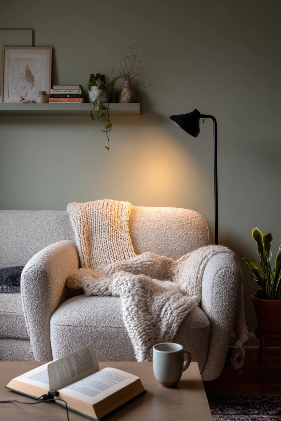
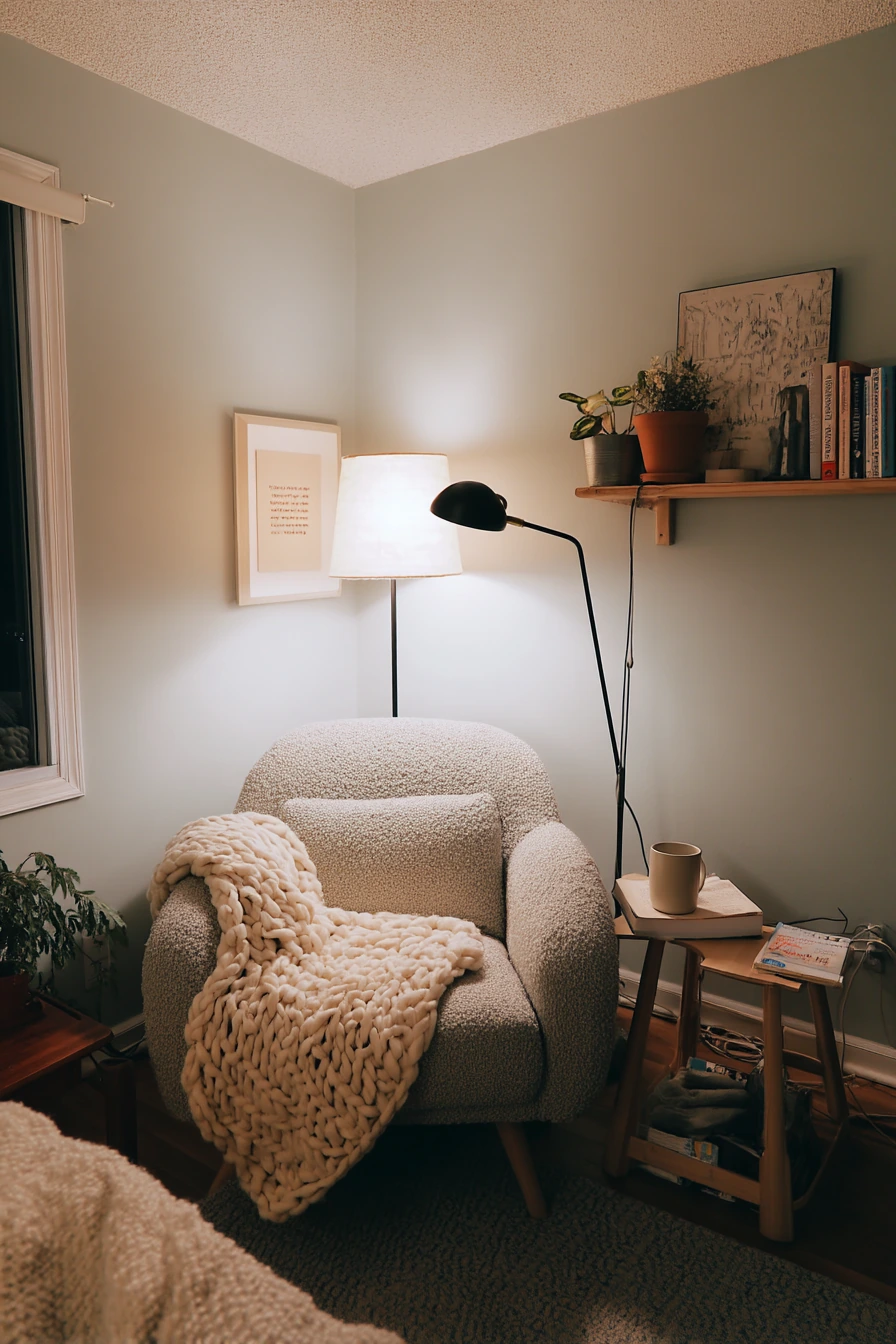
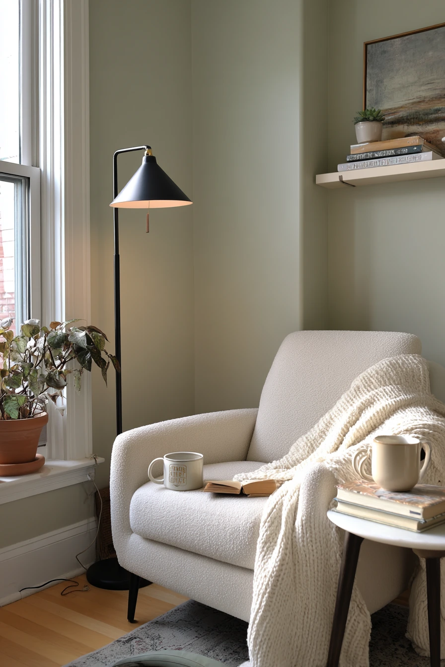
Soft sage is a gentle green that reads fresh but still feels neutral. It is a smart choice for a small living room reading nook, especially for a solo renter who wants a calm space. Against soft sage walls, a boucle armchair, a slim black floor lamp, and a small side table look clean and modern without feeling cold.
This color looks best with warm practical lamp light plus a little window spill. The mix keeps sage from looking gray. Small details like a ceramic mug, an open novel, and a knit blanket with a slight slump make the room feel real and comfortable. If your cat owns the best seat in the house, sage also hides fur better than pure white walls.
To style soft sage, use pale wood accents and keep decor low and light. A low art shelf with a few frames and a plant or two is enough. Try not to overdo green decor; let the paint be the main color. Keep cords, like a charging cable draped near the sofa, controlled with clips or a small basket so the corner still looks peaceful.
- Pair sage with pale oak, cream, and soft black for balance.
- Choose one cozy texture, like boucle or knit, and repeat it once.
- Add a small side table with a tray for mug, book, and glasses.
- Use warm bulbs to keep the green from looking dull at night.
- Keep plants simple: one tall floor plant and one small shelf plant.
Pro Design Tip: If the room faces north, pick a sage that leans slightly warm so it does not turn flat or cool in shade.
Budget Considerations: For renters, peel-and-stick wallpaper in a sage tone or removable wall decals can give a similar vibe without repainting.
3. Pale Blue Living Room Paint for a Work-From-Home Apartment
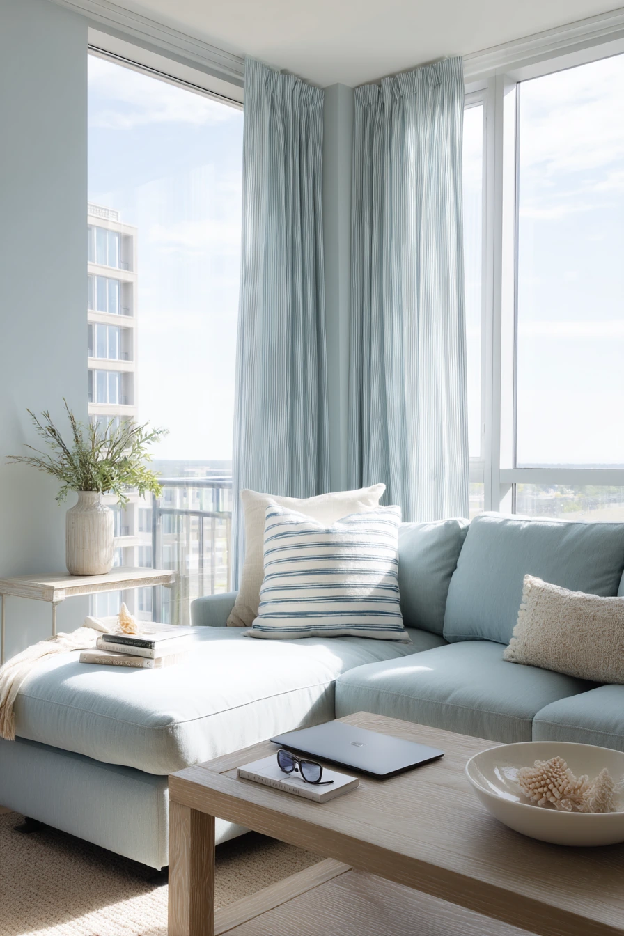
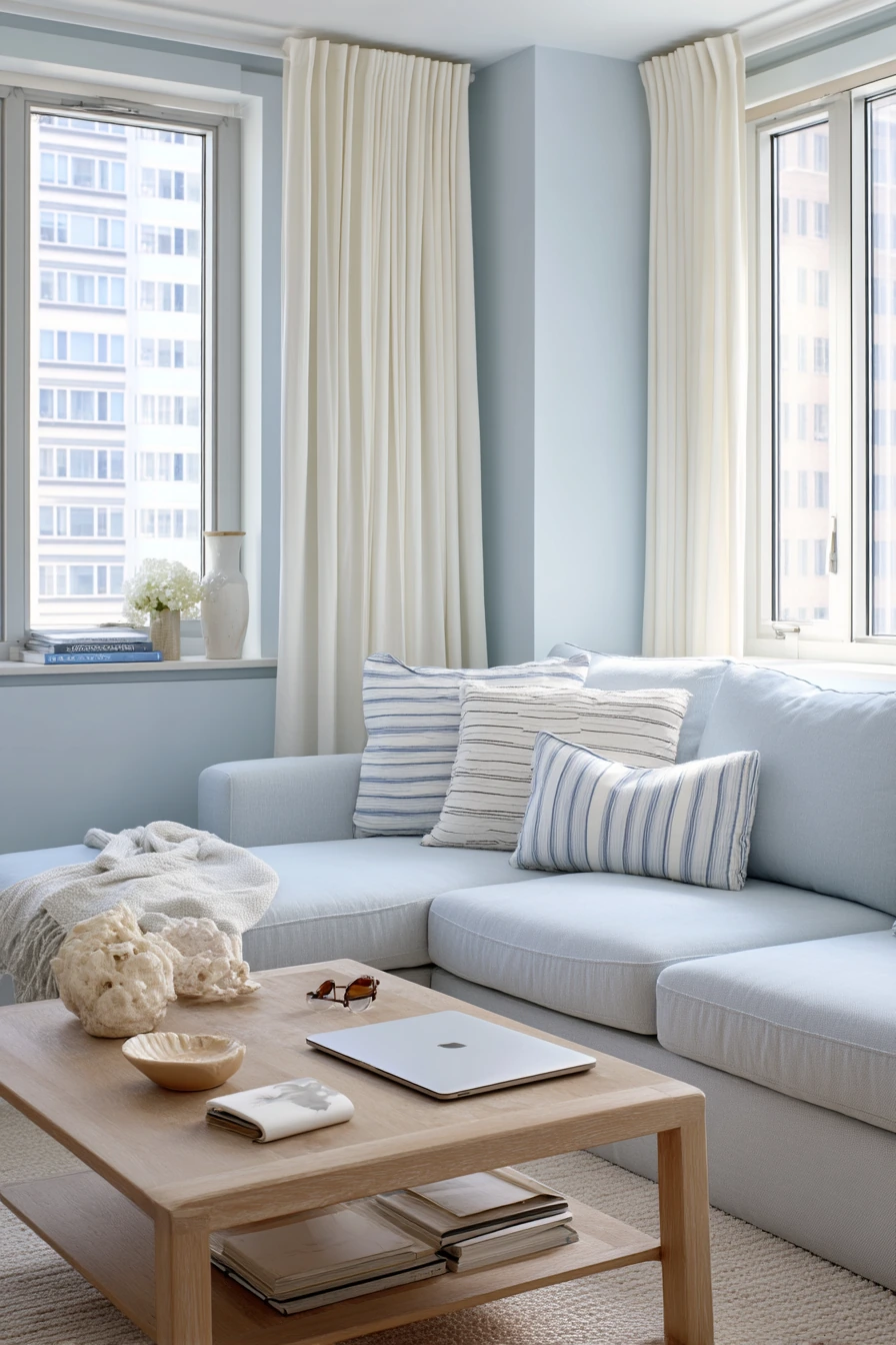
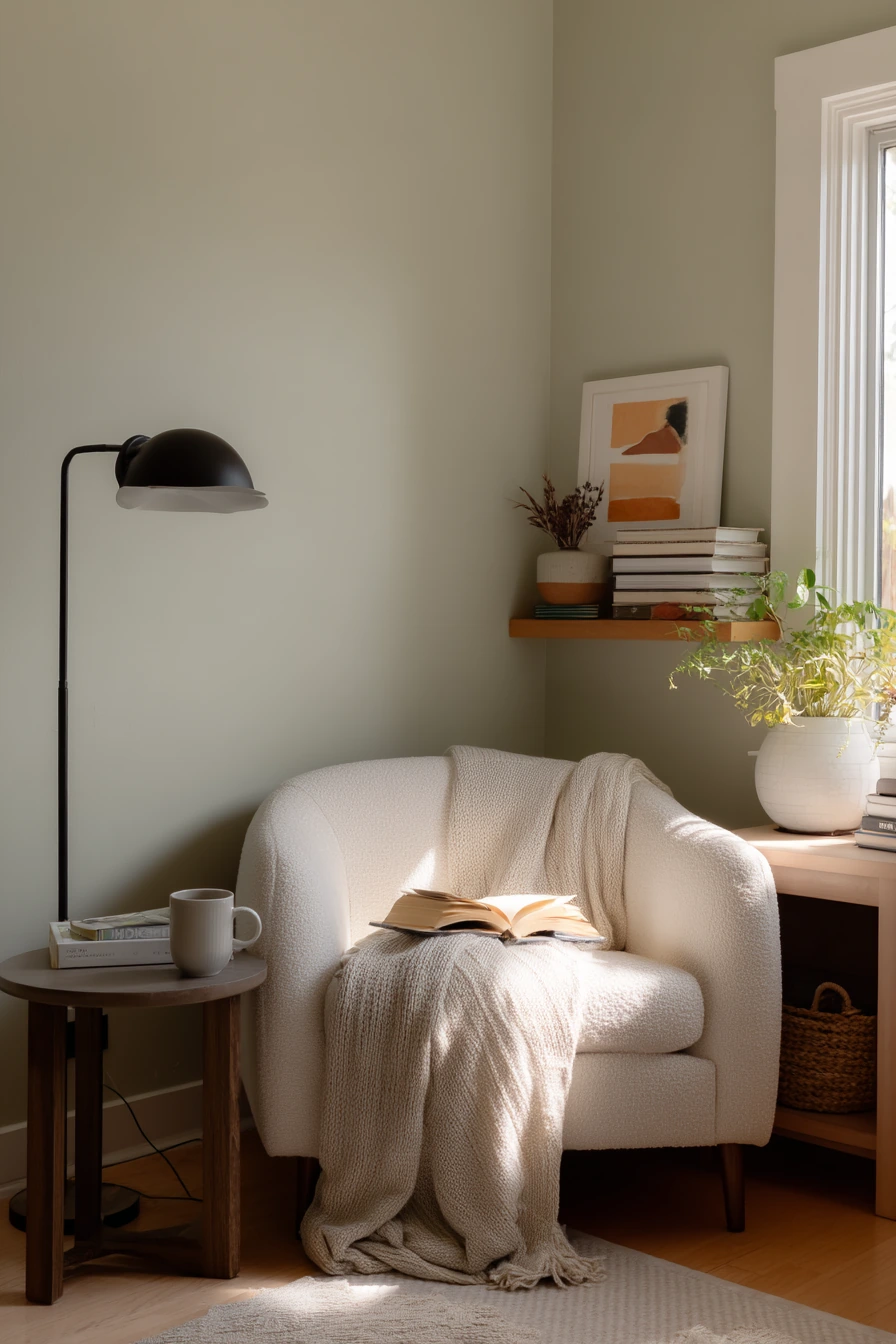
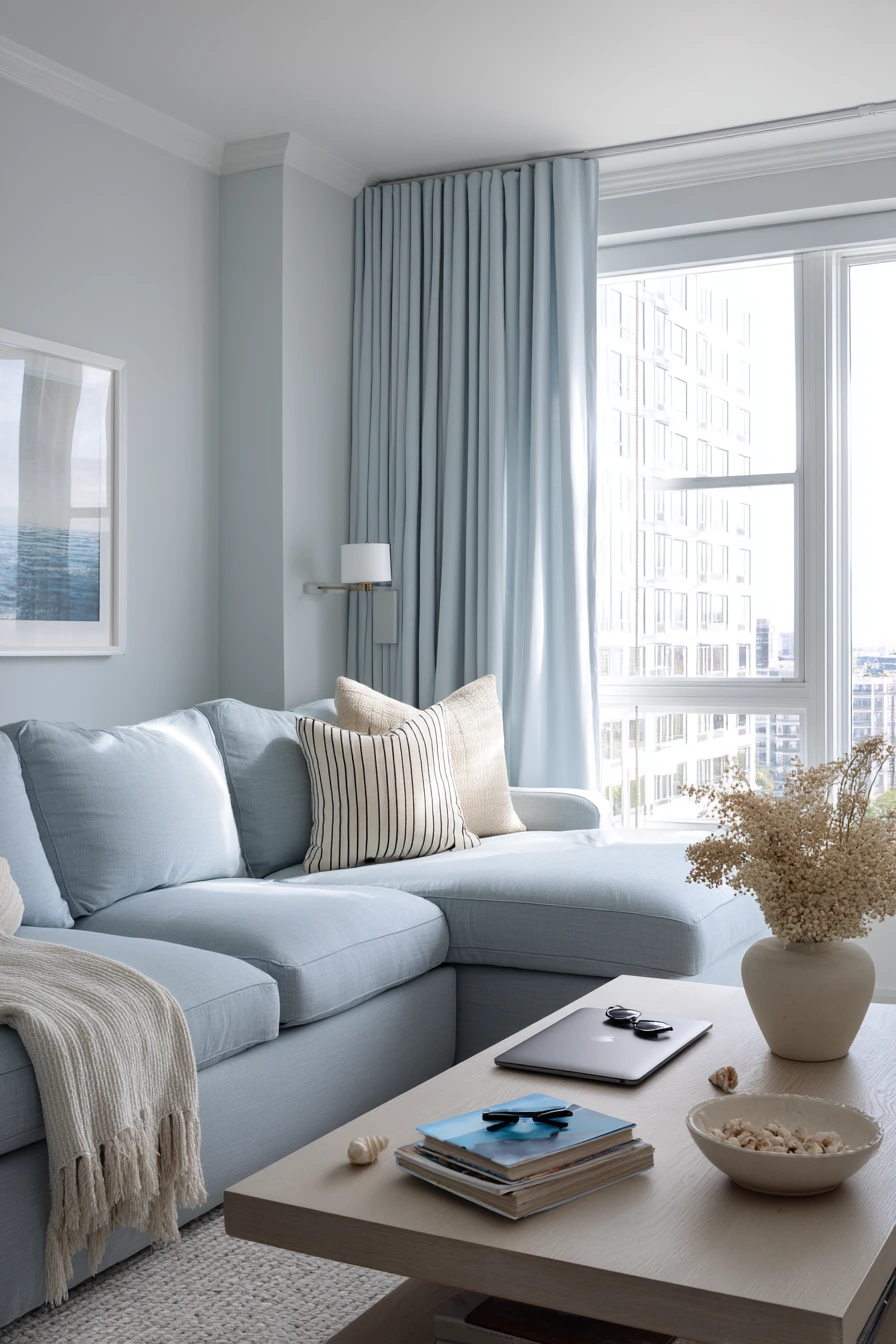
Pale blue is a calm choice for a compact apartment living room, especially for a couple who works from home. It supports focus during the day and feels cool and clean in soft morning window light. With airy curtains and a compact sectional, pale blue makes the room look bigger without feeling stark.
This color pairs well with white oak and simple shapes. A white oak coffee table, a shell-toned vase, and striped cushions can hint at a coastal feeling without looking themed. Everyday items like a closed laptop beside a notebook, sunglasses by a bowl, and a small stack of mail will still look neat because pale blue is forgiving and soft.
To style pale blue, keep your main fabrics neutral and use one or two patterns only. Stripes are easy because they read classic and not busy. Add a soft texture, like linen or cotton, to keep the room from feeling cold. If your living room doubles as a work zone, store chargers and paper in a lidded box so the paint color stays the star.
- Choose a pale blue with a hint of gray for a modern look.
- Use warm wood to keep the space from feeling chilly.
- Keep decor coastal-lite: one vase, one striped pillow, one natural fiber basket.
- Pick white or off-white trim to make the walls feel crisp.
- Create a mail drop spot with a tray so papers do not spread.
Pro Design Tip: Balance pale blue with one warm element in every sight line, like oak, tan leather, or a warm white rug, so the room stays welcoming.
Budget Considerations: Instead of new furniture, swap in warm-toned pillow covers and a thrifted wood side table to make pale blue feel finished.
4. Clay Beige Living Room Paint for Simple Rental Decor
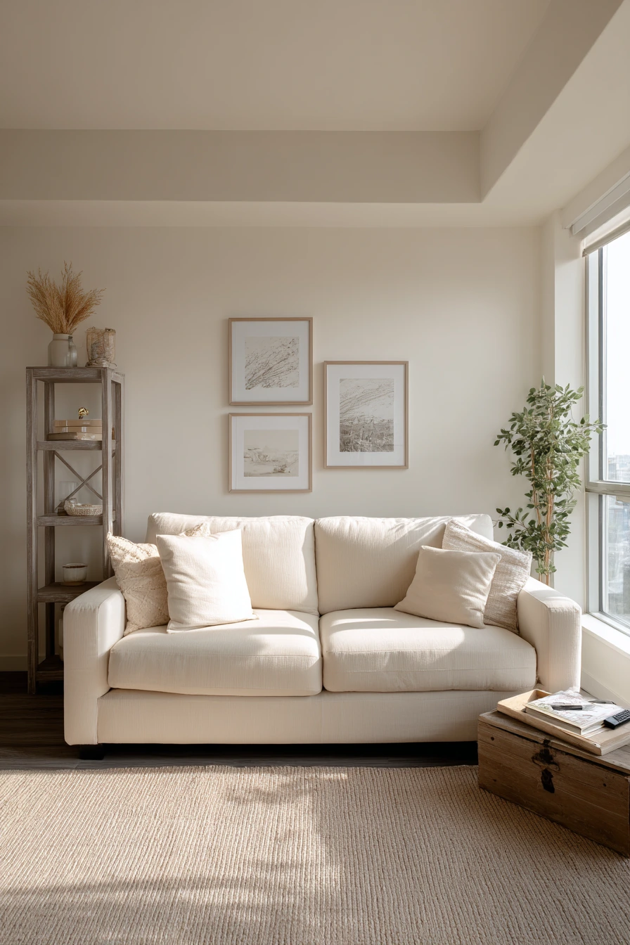
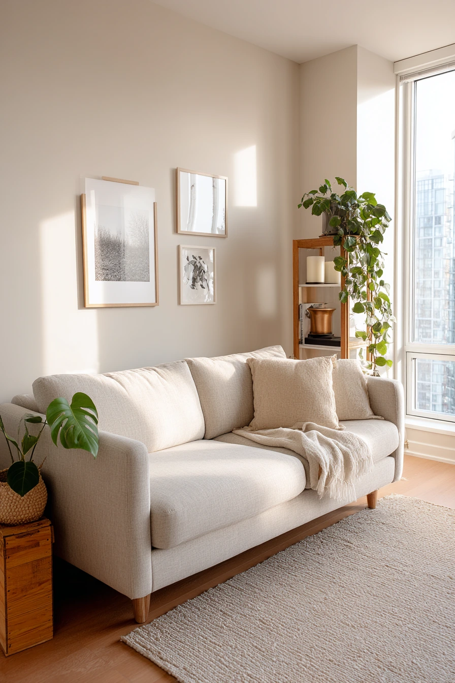
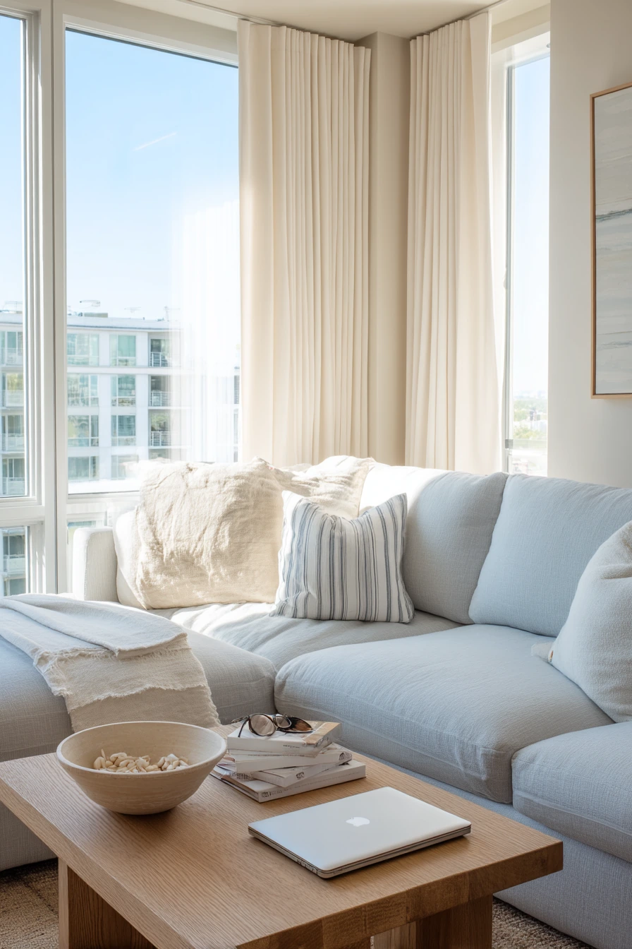
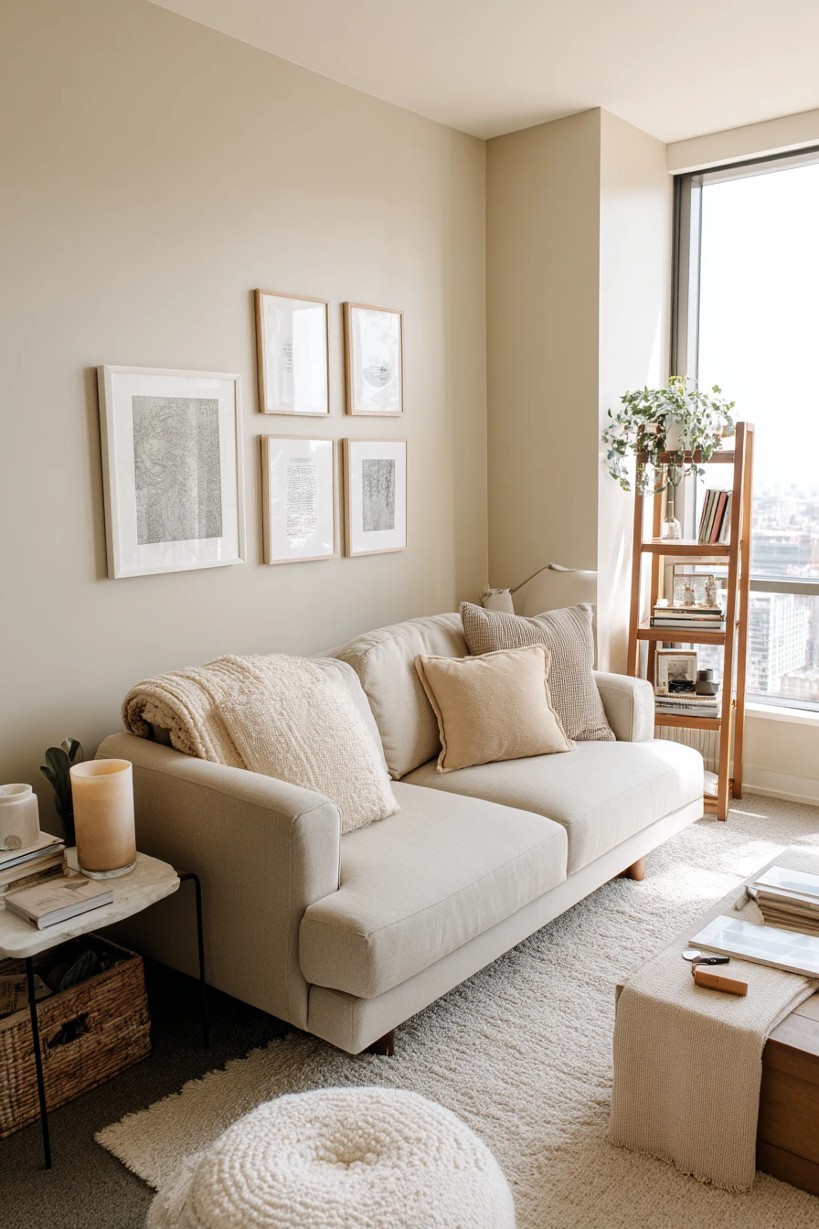
Clay beige is a warm neutral that feels grounded and modern. It works well in a rental living room because it looks good with simple, reversible decor. With late afternoon window light, clay beige turns soft and cozy, and it hides small wall flaws better than brighter paint.
This shade pairs easily with matte textures and warm neutrals. A slim sofa, a freestanding bookcase, and a plant on a crate can look intentional when the wall color is steady. Small signs of real life, like a candle, a remote on the armrest, and a slightly crooked rug edge, do not feel messy because the palette is calm.
To style clay beige in a rental, focus on items you can move later. Use peel-and-stick framed prints, removable hooks, and a rug that anchors the seating area. Keep wood tones similar, like light to medium oak, so the room does not feel mixed up. Add one darker accent, like a black lamp or frames, to keep the beige from feeling too plain.
- Pick a clay beige that leans warm, not yellow.
- Use removable art and avoid heavy wall shelves if you rent.
- Layer a flatweave rug over carpet if needed for a clean edge.
- Add a crate or small stool as a flexible plant stand.
- Use a basket to hide cords and small items near the sofa.
Pro Design Tip: Keep your large pieces simple and let the wall color add the warmth; this makes the room look more expensive and less cluttered.
Budget Considerations: Peel-and-stick frames and removable hooks cost less than new wall decor, and they help you avoid repair fees when you move.
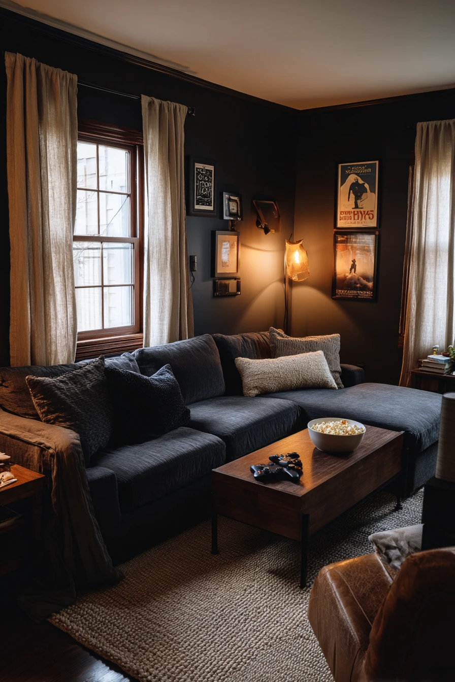
5. Charcoal Accent Wall Living Room Paint for Movie Nights
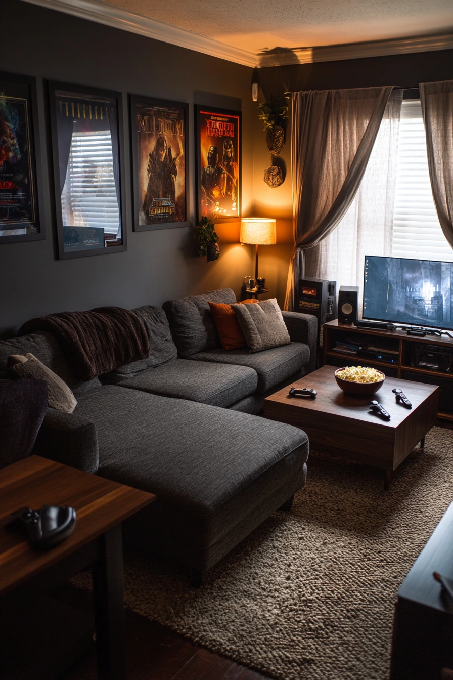
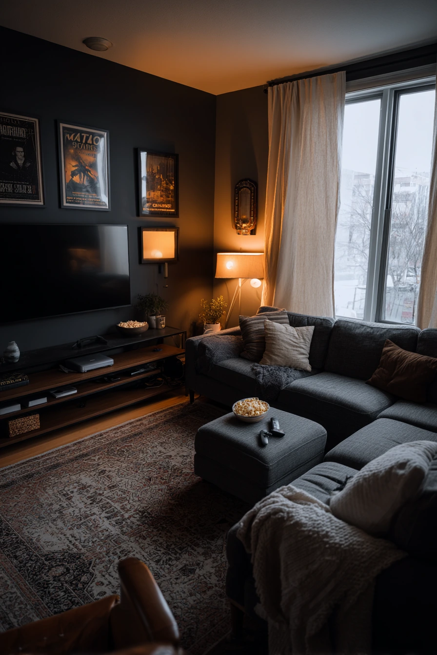
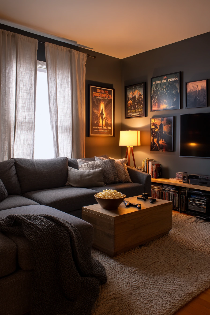
A charcoal accent wall is a strong choice if your living room is used for movies and game nights. Dark paint adds depth and makes the TV wall feel less harsh, especially with warm lamp light and a faint window glow. In a real room, charcoal looks rich behind a low media console, framed posters, and soft linen drapes.
This color also makes a deep sofa feel cozy instead of heavy, as long as you balance it with lighter textures. A textured rug, pale curtains, and a few light pillows keep the room comfortable. Everyday items like scattered coasters, a popcorn bowl, a folded throw, a game controller, and a charging cable near the side chair can still look fine if you give them a home.
To style a charcoal accent wall, keep the other walls light and warm, like off-white or soft greige. Use wood tones, woven baskets, and brass or black lighting to create contrast. If you have posters, choose frames that match your hardware so the wall looks collected, not random. Add one tall lamp and one table lamp for layered light that keeps the dark wall from feeling flat.
- Use charcoal on one wall only if your room is small or low light.
- Choose warm white bulbs to soften the dark paint at night.
- Add light drapes to frame the window and balance the wall.
- Use a tray or bin to gather remotes, controllers, and cables fast.
- Pick a rug with texture to keep the space from feeling too sleek.
Pro Design Tip: Paint the accent wall in a matte or velvet finish to reduce glare from screens and make the color look deeper.
Budget Considerations: If full repainting is not possible, try a charcoal peel-and-stick mural or paint only the area behind the media console for a similar effect.
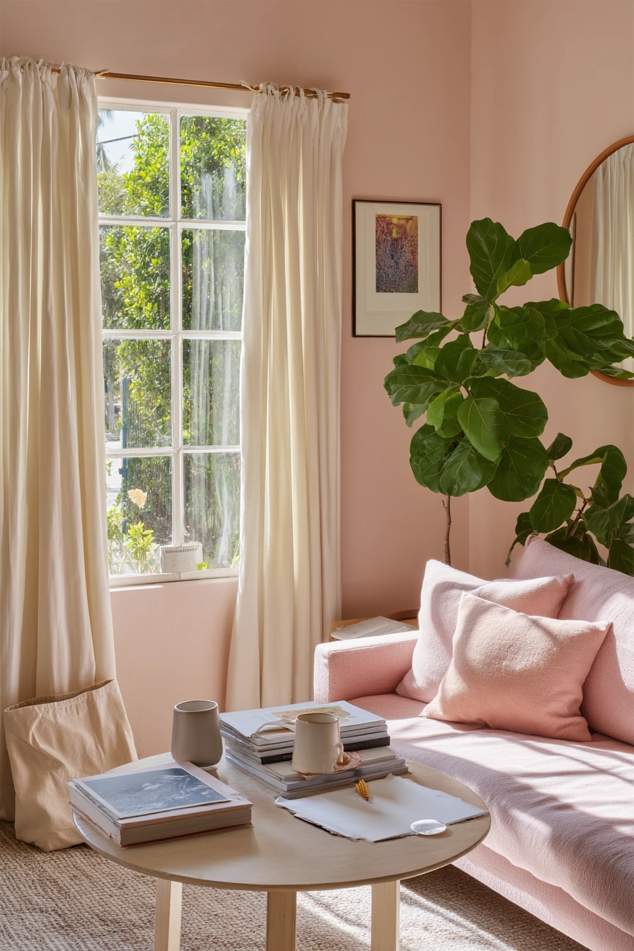
6. Dusty Pink Living Room Paint for a Bright Studio Space
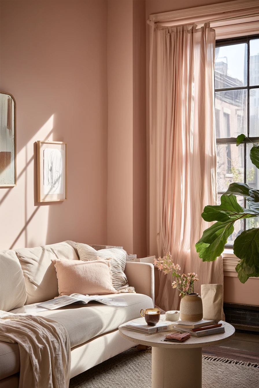
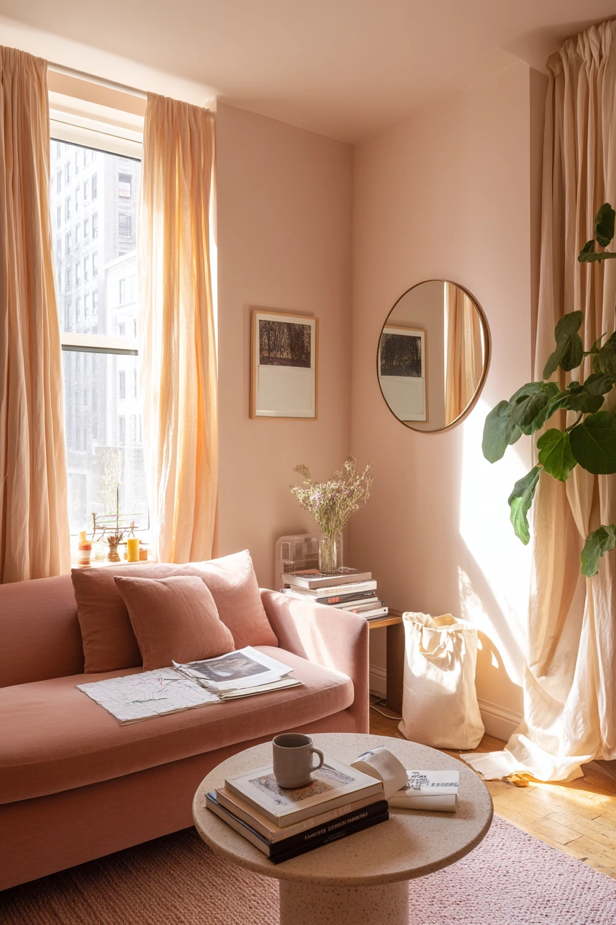
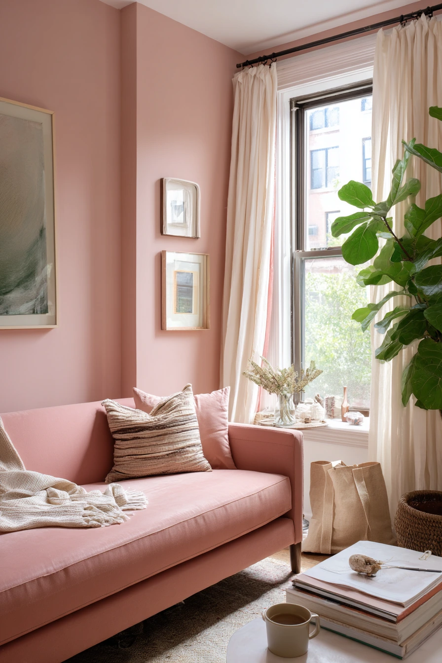
Dusty pink can feel soft and grown-up when it is muted and sun-washed. In a studio living room, it brings warmth without making the room look small. Natural window light only is perfect for this shade because it shows the gentle tone and keeps it from looking too sweet.
Dusty pink works well with simple shapes and a few personal items. A compact sofa, a round mirror, art books, and an open sketchpad make the room feel creative but not staged. A ceramic coffee cup and a tote bag on the floor fit the mood, as long as the rest of the space stays calm. One large leafy plant adds a cool green note that keeps the pink balanced.
To style dusty pink, use light neutrals and natural textures. Think airy curtains, a slim pedestal table, and a wool or cotton rug. Keep metal finishes simple, like matte black or brushed brass. If you want a modern look, pair dusty pink with warm white trim and pale wood. If you want it more cozy, add tan leather and a textured throw.
- Choose a muted pink with brown or gray undertones.
- Use one large mirror to bounce light and make the studio feel bigger.
- Keep art simple: a few frames or one larger piece, not many small ones.
- Add green with one big plant instead of many small pots.
- Store creative supplies in a basket so surfaces stay clear.
Pro Design Tip: Dusty pink looks best when you repeat it once more in the room, like one pillow or one piece of art, so it feels intentional.
Budget Considerations: A thrifted mirror and secondhand art books can build the same creative look for less than new decor.
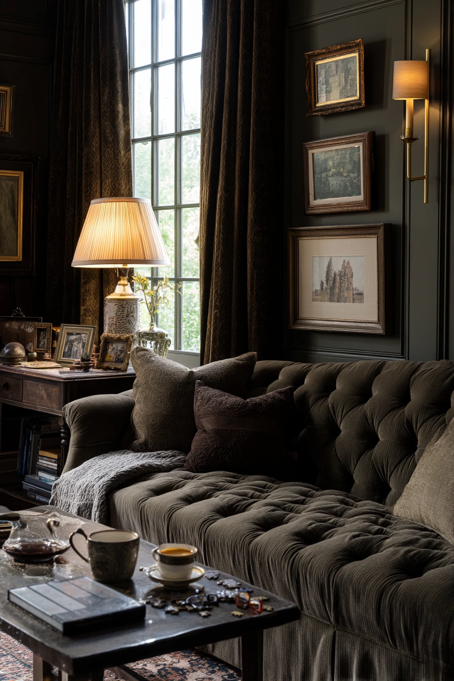
7. Deep Olive Living Room Paint for a Traditional, Lived-In Home
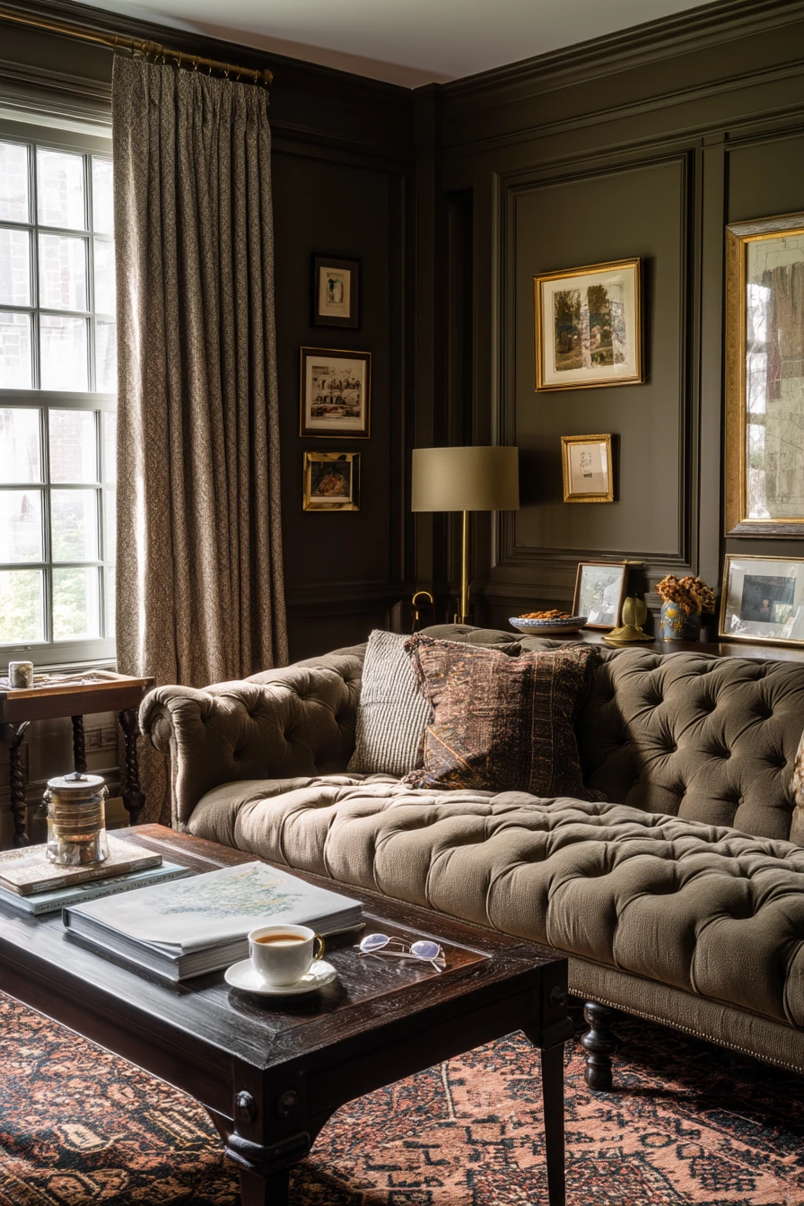
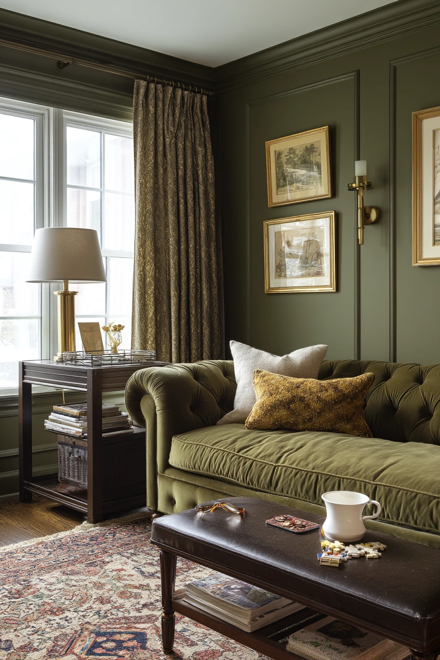
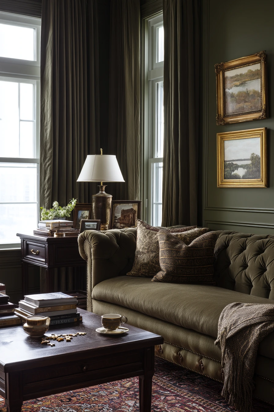
Deep olive is a strong, classic green that makes a living room feel cozy and collected. It is a great option for a multigenerational household because it hides wear and supports many styles at once. With soft evening practical light and a little window light, deep olive turns rich and warm.
This color looks natural with traditional pieces like a tufted sofa and dark wood side tables. Brass lamps, wool textures, and layered curtains add to the grounded feel. Family life details, like framed photos, folded reading glasses, a tea cup, and a child’s puzzle pieces near the rug, look normal and not messy because the wall color is deep and steady.
To style deep olive, keep your large items classic and focus on layers. Add a wool rug, a textured throw, and a mix of pillows in cream, tan, and rust. If the room feels dark, brighten it with light curtains and a few lighter frames. Use warm bulbs and more than one lamp, so the color feels inviting instead of heavy.
- Pair deep olive with warm whites, camel, and brass for a timeless mix.
- Use dark wood to make the green feel traditional and cozy.
- Choose a rug with pattern to hide crumbs and daily wear.
- Layer curtains: sheers plus heavier panels for a finished look.
- Display family photos in matching frames to reduce visual clutter.
Pro Design Tip: Add lighting at different heights, like a table lamp and a floor lamp, so deep olive walls look rich and not flat.
Budget Considerations: If repainting the whole room is too much, paint only the wall behind the sofa in deep olive and keep the rest warm white.
8. Creamy White Living Room Paint for a Small, Flexible City Room
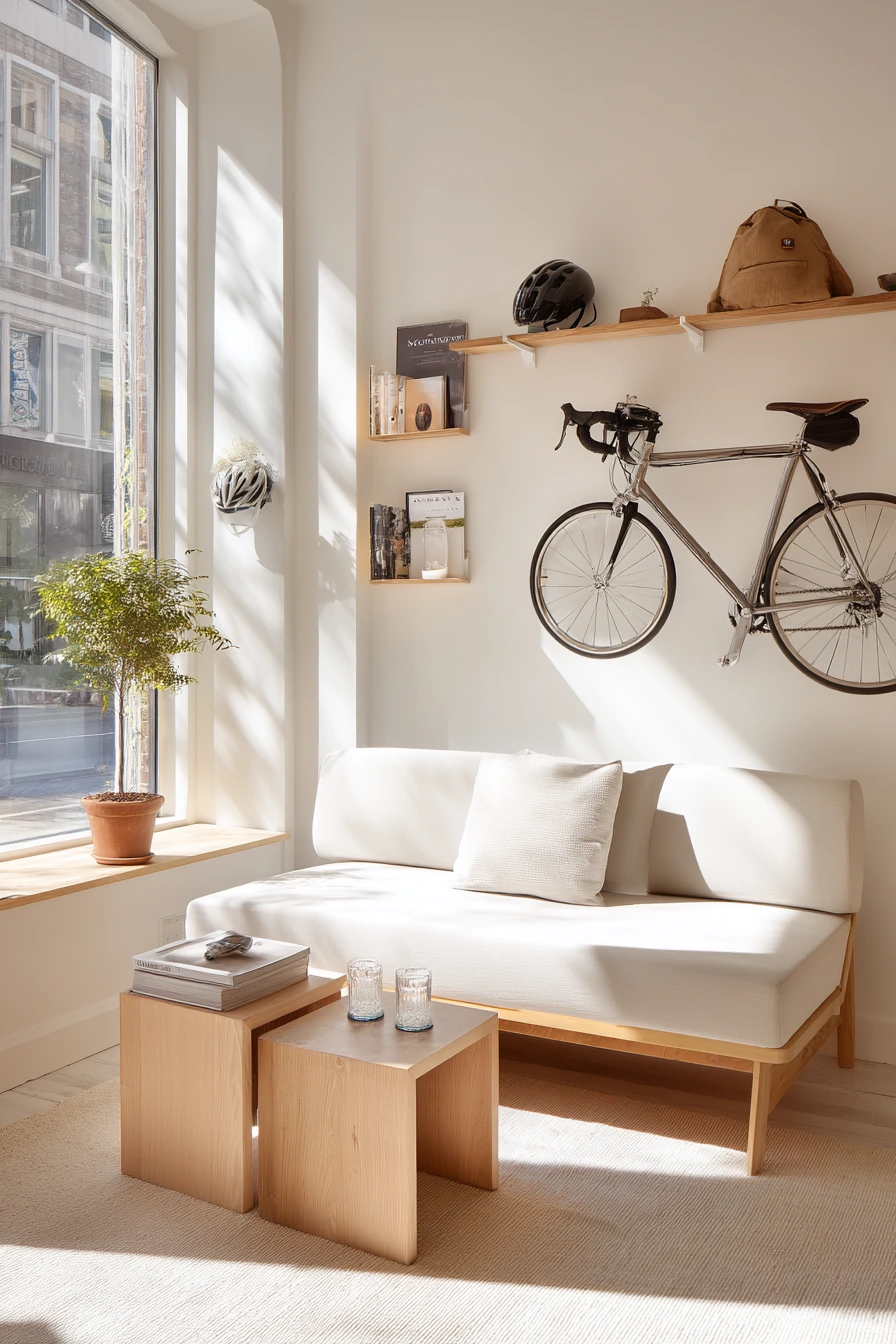
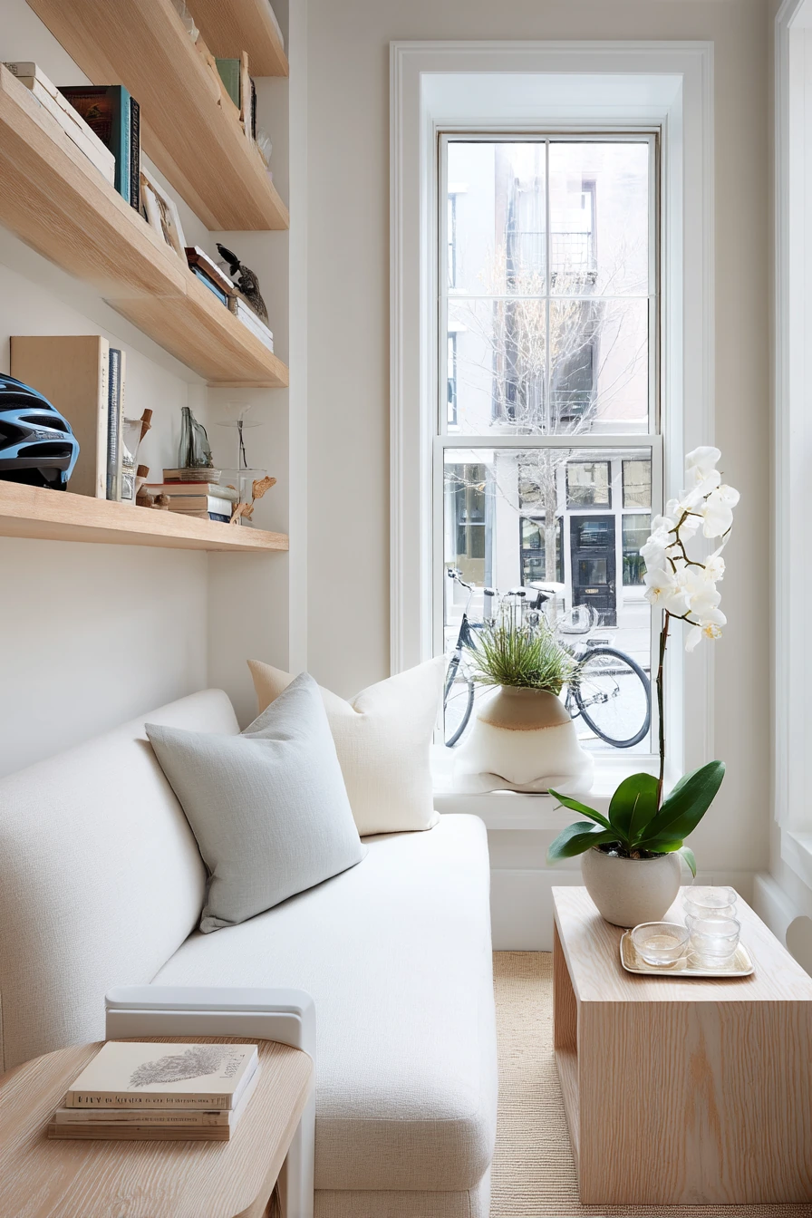
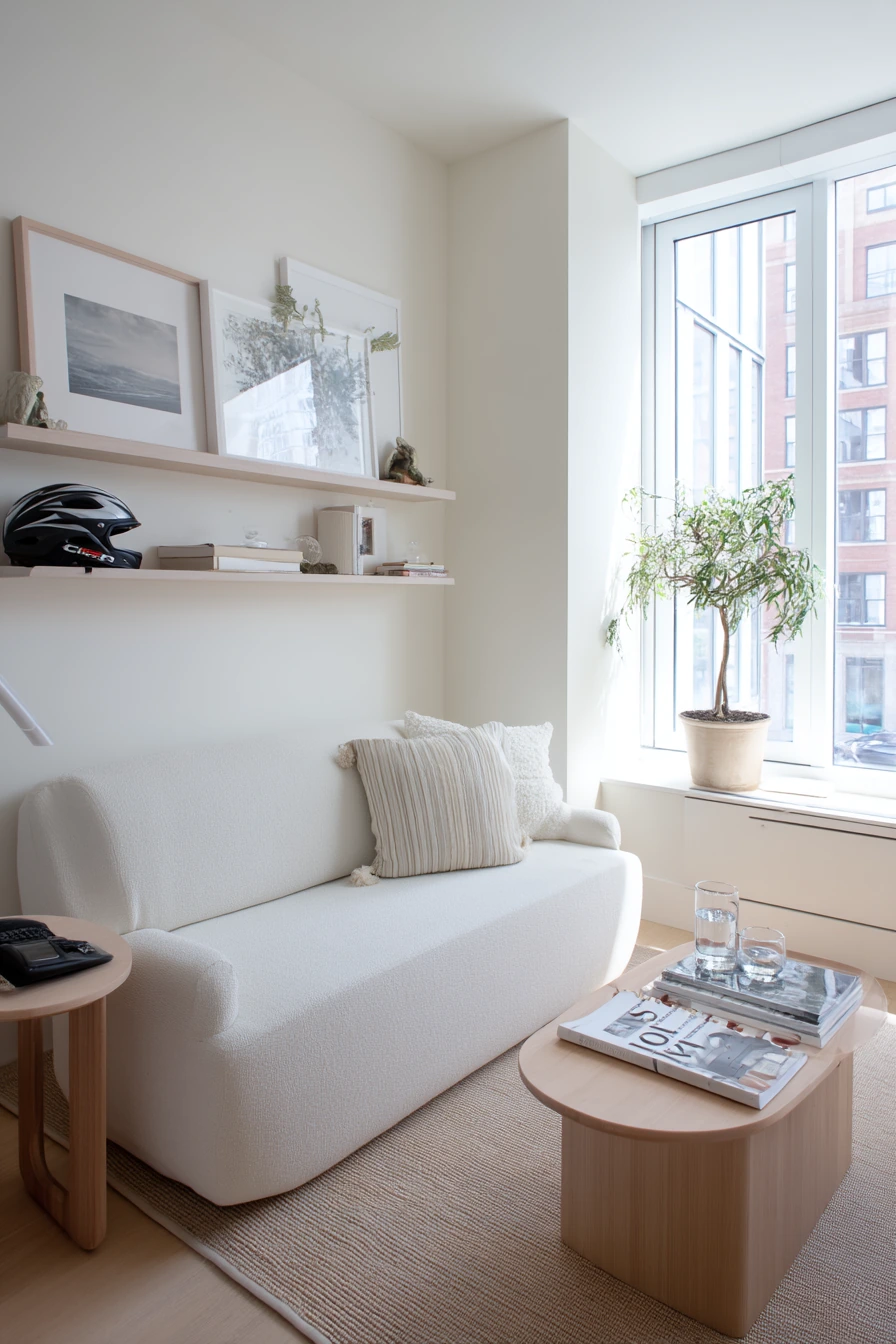
Creamy white is a top pick for a small living room when you need flexibility. It reflects bright but soft window light and helps the space feel open. Unlike stark white, creamy white has a little warmth, so it feels calm with light oak, pale jute, and a sculptural plant.
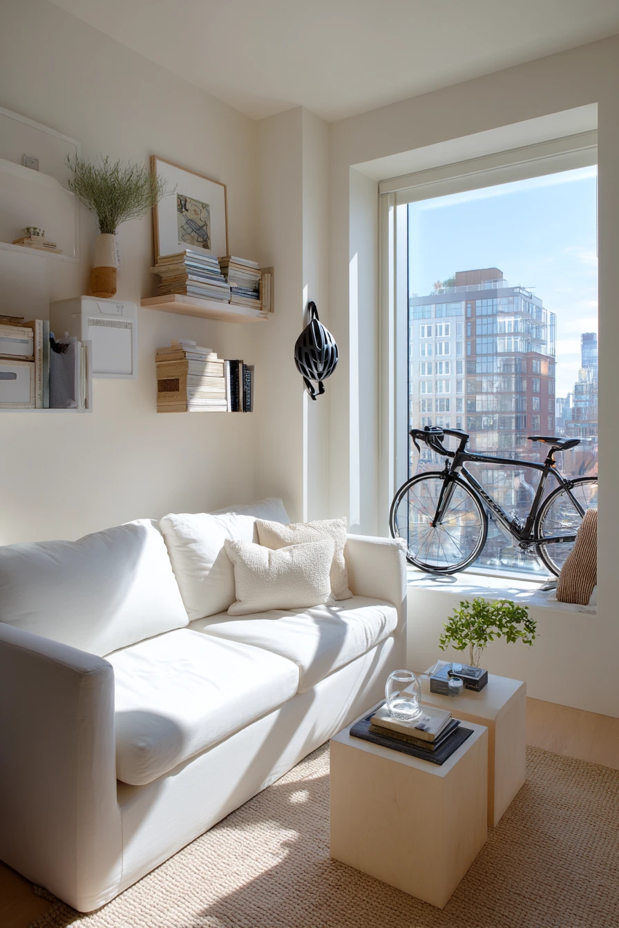
In a city apartment, the living room often holds extra items like a bike helmet by the door, magazine stacks, a water glass, and a phone charger snaking from the outlet. Creamy white makes these everyday moments look cleaner, but it also shows clutter faster, so smart storage matters. Wall-mounted shelves and nesting tables help you change the layout when needed.
To style creamy white, use a tight color palette and let texture add interest. Choose one wood tone, one metal finish, and one accent color. A jute rug, linen curtains, and a few matte ceramics keep the room from feeling plain. For cords, use a cord cover or a small basket near the outlet so the walls still look tidy in photos and in real life.
- Pick a creamy white with warm undertones for a softer look.
- Use nesting tables so you can clear space fast.
- Add wall shelves to keep the floor open in a small room.
- Choose a jute or flatweave rug for light texture and easy cleaning.
- Hide chargers in a box or basket near the sofa and entry.
Pro Design Tip: Match the white on your trim and ceiling to the wall white, or go one step brighter on trim, to keep edges crisp without harsh contrast.
Budget Considerations: Creamy white paint is affordable, but prep matters; spend a little on spackle and sanding so the finish looks smooth.
9. Muted Terracotta Living Room Paint for Hosting Friends
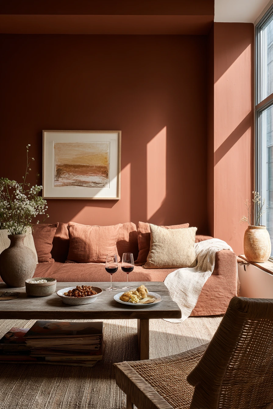
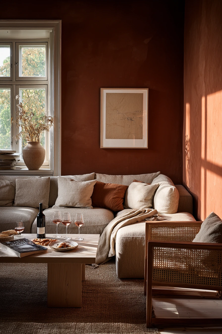
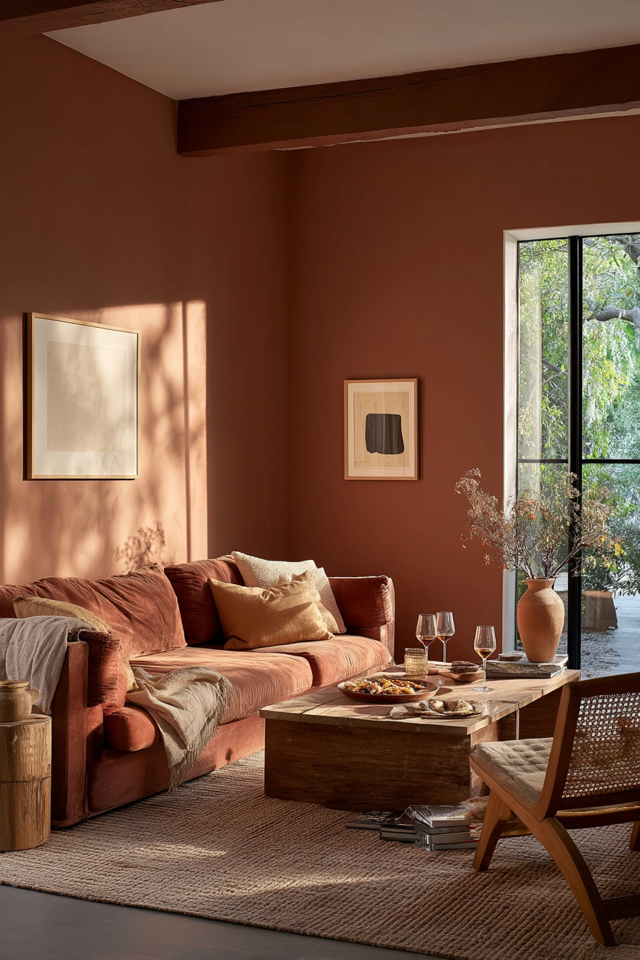
Muted terracotta brings warmth and an earthy feel that works well for hosting. It feels welcoming after work, especially in late-day sunlight when the walls glow. This is one of the best living room paint color ideas if you want a space that feels social but still relaxed.
Terracotta pairs well with warm wood, cane chairs, textured pottery, and a few framed prints. In a real hosting setup, you might have wine glasses on the coffee table, half-eaten snacks, a throw casually folded, and a stack of board games near the window. The color helps the room feel cozy and forgiving, even when things are not perfectly put away.
To style muted terracotta, keep the big pieces simple and use natural materials. Choose a sofa in cream, warm gray, or camel. Add black accents in small amounts, like frames or a lamp, to sharpen the look. If you worry the color will be too strong, use terracotta on one wall, or choose a lighter, clay-like version and bring in deeper tones with pillows.
- Pair terracotta with cream and warm wood for a balanced palette.
- Use cane or rattan for light texture that keeps the room airy.
- Choose pottery and matte decor to match the earthy tone.
- Keep a game basket or shelf near seating for easy hosting.
- Add a washable rug if you host often and snacks happen.
Pro Design Tip: Repeat terracotta in small touches, like one pillow and one vase, so the wall color feels tied into the room.
Budget Considerations: If you want the look without painting, start with terracotta pillow covers and thrifted pottery, then paint later if you still love it.
10. Soft Taupe Living Room Paint for a Calm Evening Space
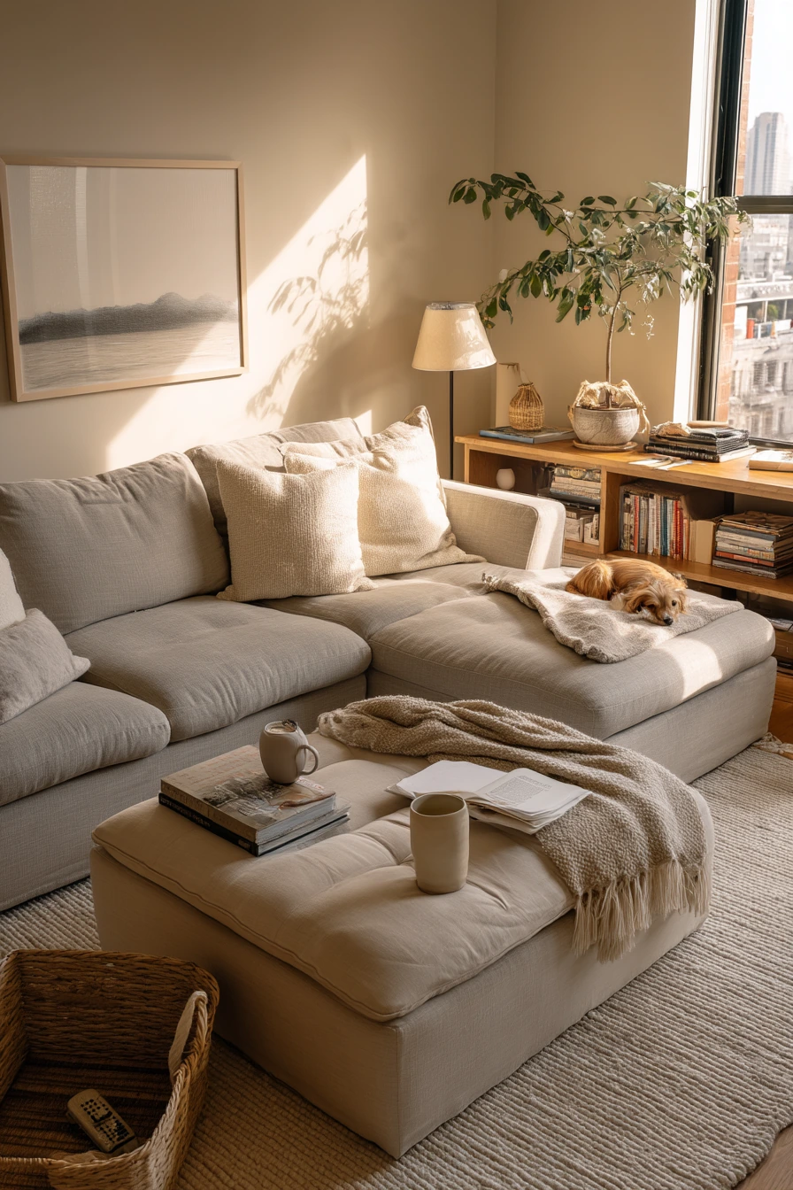
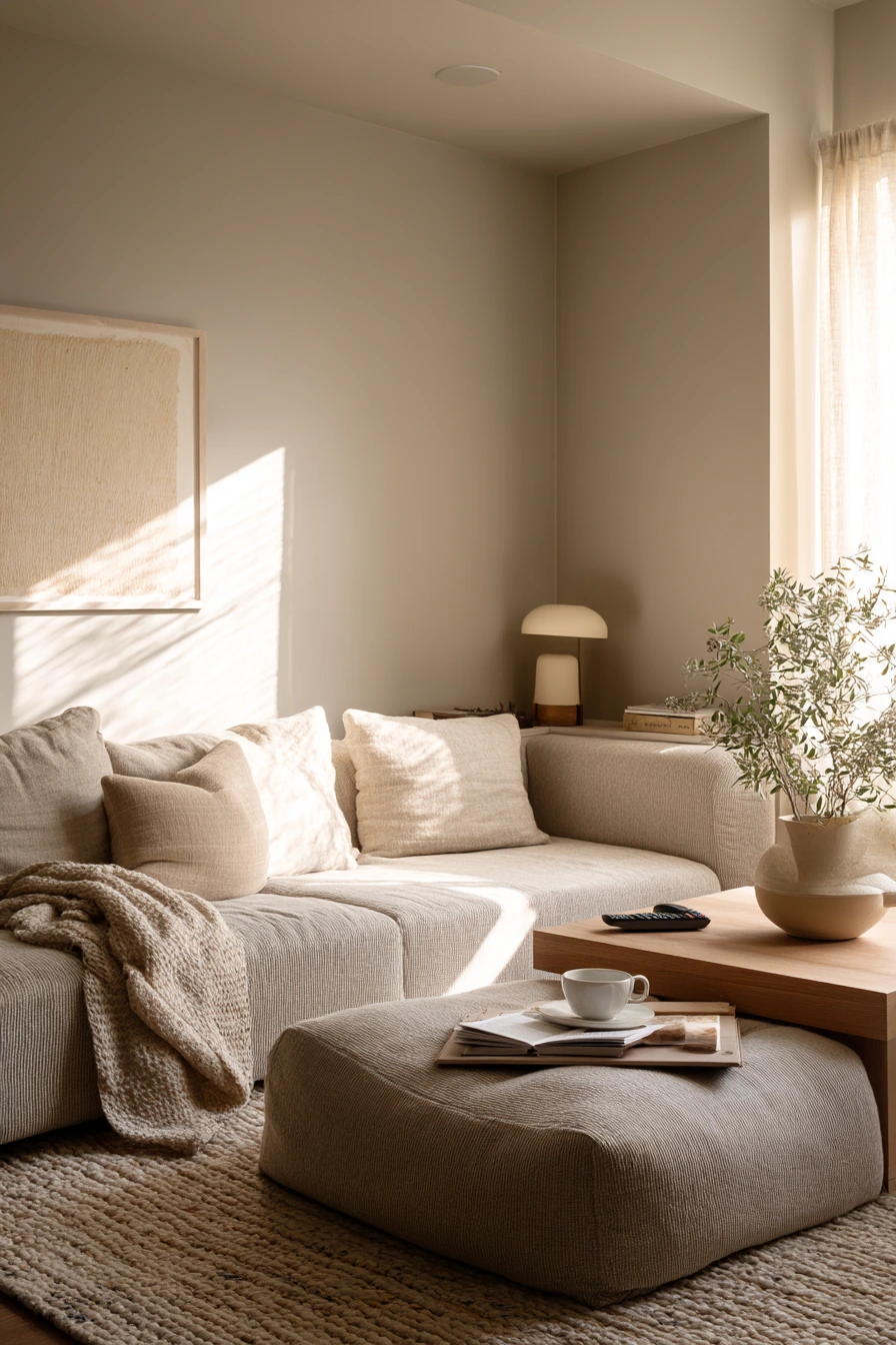
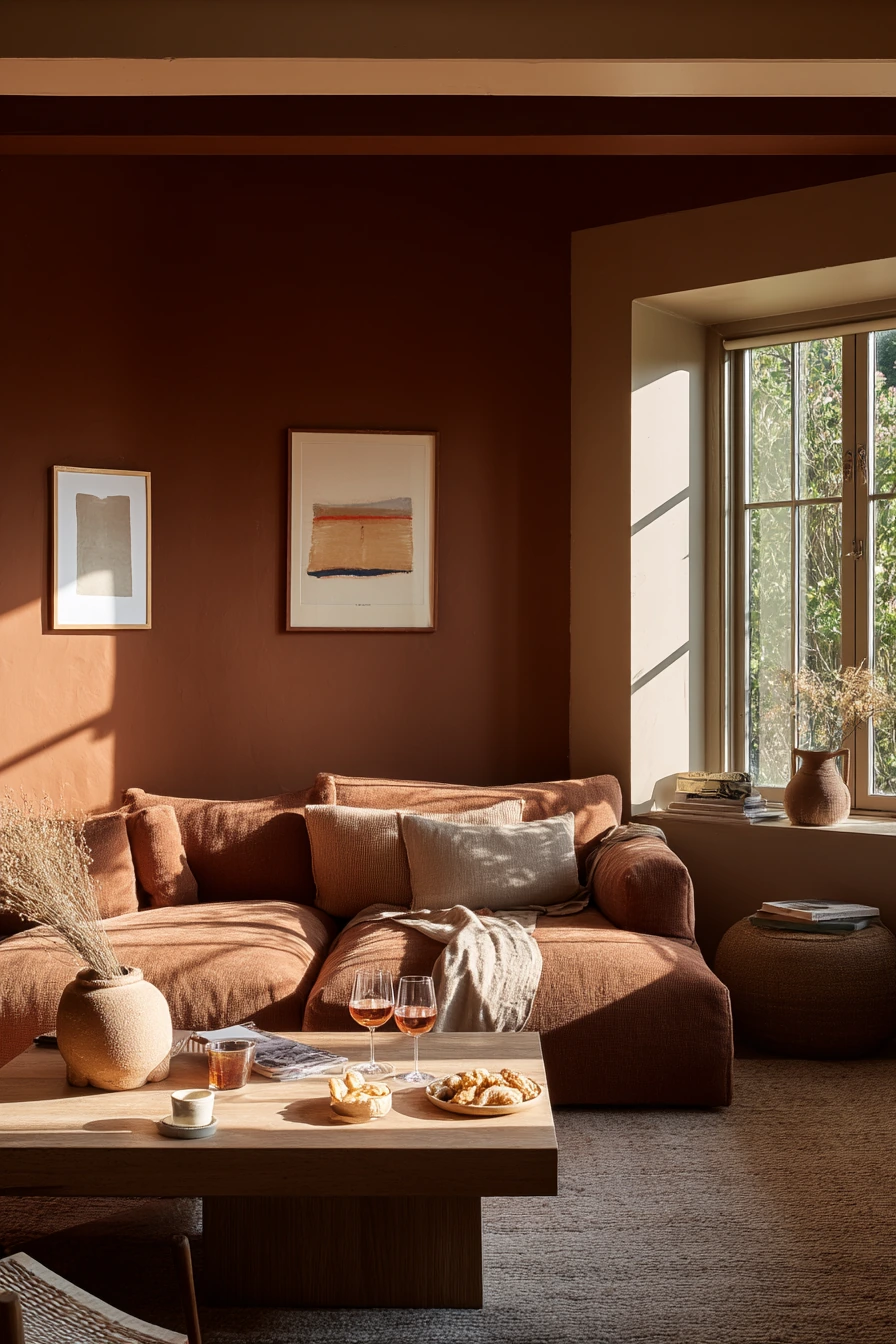
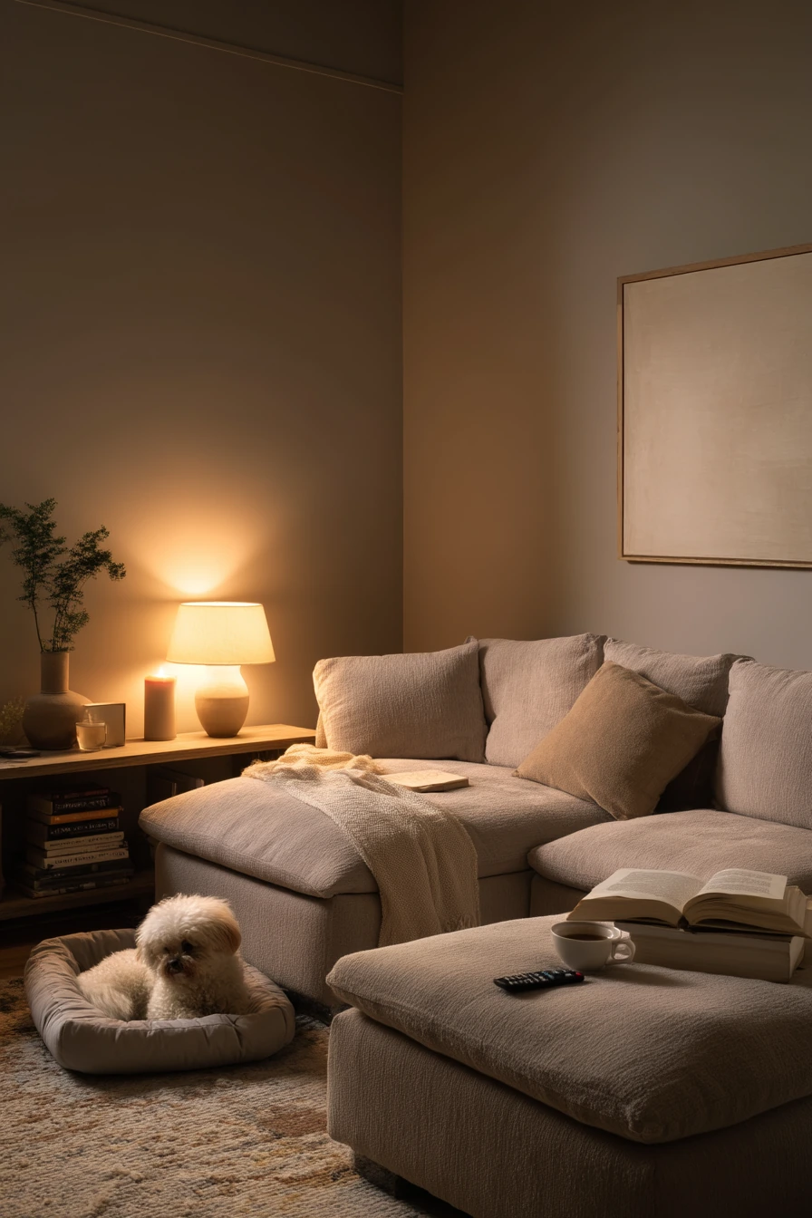
Soft taupe is a cozy neutral that works well for winding down. It is a good fit for a busy couple’s living room because it looks clean with linen, wool, and simple art, even when there is an open book, a remote, and a tea mug on the table. Warm practical lamp light with a faint window afterglow makes taupe feel restful.
This shade pairs nicely with a low sectional and a linen ottoman. It also supports small comfort zones, like a dog bed tucked beside the console. Taupe is less gray than many modern neutrals, so it feels warmer and more inviting. Add a ceramic lamp, a wool rug, and one plant casting soft shadows for a lived-in look that still feels tidy.
To style soft taupe, keep contrast low and focus on texture. Use a mix of warm whites, oatmeal, and light wood. Add one darker detail, like a black frame or side table, to keep the room from blending together. Make sure you have layered lighting, since taupe can look flat with only overhead light.
- Choose a taupe with warm undertones for a relaxed feel.
- Use linen and wool to add texture without strong patterns.
- Keep art subtle and not too bright for a calm mood.
- Add a plant to create soft shadows and natural depth.
- Create a small tray for remotes and mugs to reduce clutter.
Pro Design Tip: Test taupe at night with your lamps on, because undertones can change and may look more pink or more gray depending on bulbs.
Budget Considerations: Switch to warm LED bulbs and add one extra lamp before you buy new decor; lighting often fixes a room faster than furniture.
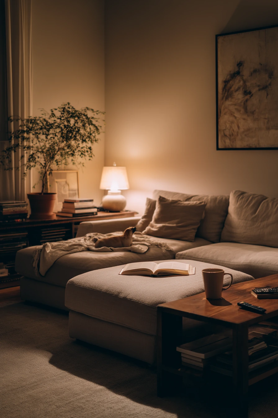
These living room paint color ideas are meant for real homes, with real life on the coffee table and real light coming through the windows. Warm greige, sage, pale blue, clay beige, charcoal, dusty pink, deep olive, creamy white, muted terracotta, and soft taupe can all work when you match them to your space and your habits.
If you are unsure, start with samples and check them in morning, afternoon, and evening. Then style with texture, smart storage, and lighting that fits how you use the room.
FAQ
1) What is the best paint color for a small living room?
Creamy white and pale blue often make a small room feel bigger because they reflect light and keep the space airy.
2) How do I choose between greige and taupe?
Greige usually feels more modern and balanced between gray and beige. Taupe often feels warmer and cozier, especially under lamp light.
3) Will a charcoal accent wall make my room look smaller?
It can if the room has very little light, but it can also add depth. Balance it with light walls, bright drapes, and layered lighting.
4) What colors hide scuffs and kid mess the best?
Warm greige, clay beige, and deep olive tend to be forgiving. Matte finishes also help hide small wall marks.
5) Is sage green still a good choice for living rooms?
Yes. Soft sage is calming and easy to style with pale wood, cream fabrics, and black accents.
6) How do I make terracotta look modern, not heavy?
Use muted terracotta, pair it with cream upholstery, add black accents in small amounts, and keep decor simple with natural textures.
7) What paint finish is best for a living room?
Eggshell is a common choice because it wipes clean better than flat paint and still looks soft on walls.