
Looking for kitchen paint ideas that feel real, not staged? The right wall or cabinet color can change how your kitchen looks and how it works day to day.
In this post, you will see 10 paint color directions, from soft sage green to charcoal gray, with simple styling notes like open shelving, butcher block counters, and matte black hardware.
Each section includes practical ways to use the color, what finishes to pick, and small details that make the space feel lived-in, like a slightly wrinkled dish towel, cookbooks by the toaster, and plants catching window light.
You will also get a pro design tip and a budget note for every idea, so you can plan upgrades that fit your home and your wallet.
Intro H2: 1. Soft Sage Green Kitchen Paint Idea
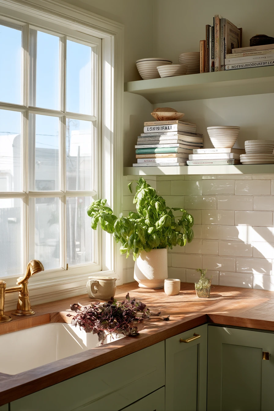

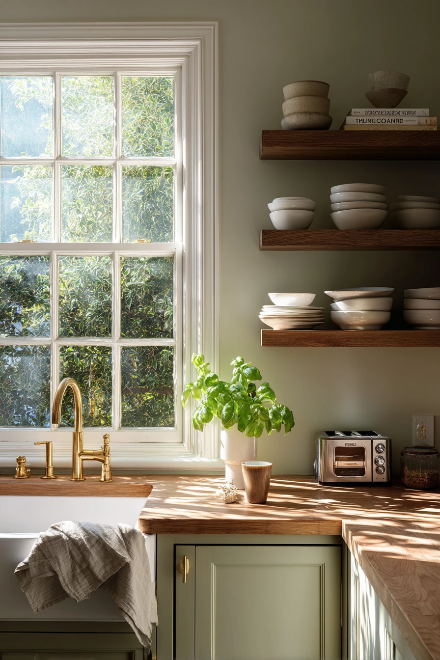
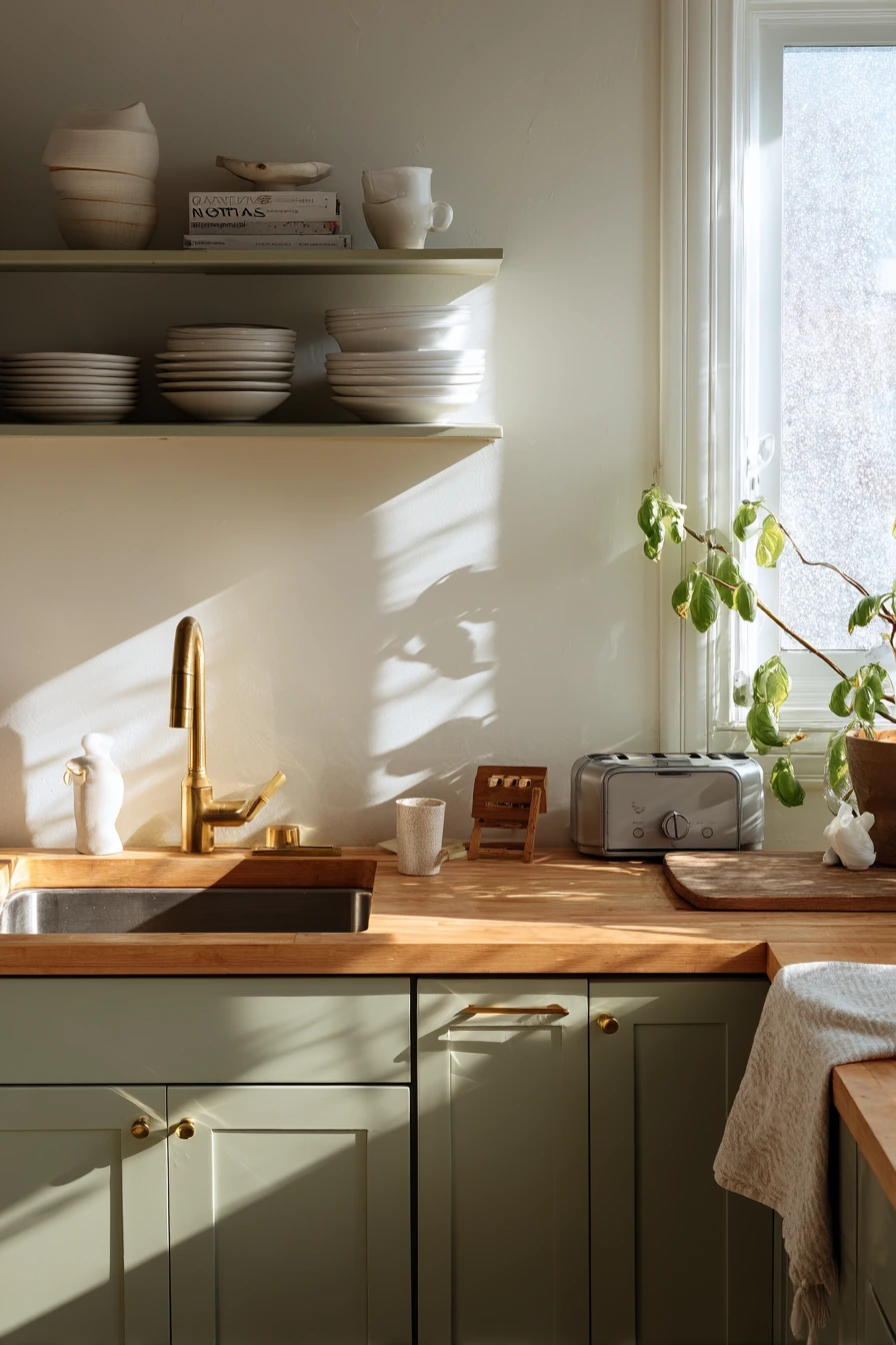
Soft sage green is a calm kitchen paint color that works well in a real family home. It reads clean in sunlit morning window light, but it still has warmth, so the room does not feel cold. Sage looks great with open shelving, especially when you keep the shelves simple with white ceramic bowls and everyday glasses. The color also helps small messes blend in, which is helpful when life is busy.
To style this look, pair sage walls or cabinets with butcher block counters for a cozy, natural feel. Add a brushed brass faucet to warm up the green and give the sink area a focal point. Keep a small basil plant near the window so the leaves catch soft shadows. Little real-life items, like a toddler’s snack cup near the sink and a slightly wrinkled dish towel, make the space feel welcoming instead of perfect.
For paint, choose a washable finish near work zones. A satin or pearl sheen wipes down easier around the sink and toaster area. If you have open shelves, keep the back wall in the same sage to make the ceramics stand out. A short cookbook stack by the toaster adds height and color without adding clutter.
- Use soft sage on cabinets for a bigger change, or on walls for a lighter update.
- Pair with white dishes and simple shapes to keep shelves looking tidy.
- Add butcher block counters or a wood cutting board for warm contrast.
- Use brushed brass for the faucet or cabinet pulls to balance the cool green.
- Style with a small herb plant and one linen towel to keep it calm.
Pro Design Tip: Test sage green on two walls and watch it all day; morning light can make it look brighter, while evening light can make it feel more muted.
Budget Considerations: If new counters are not in the budget, add the butcher block look with a large wood board, wood stools, or wood shelf brackets.
Intro H2: 2. Warm White Paint for a Small Rental Kitchen
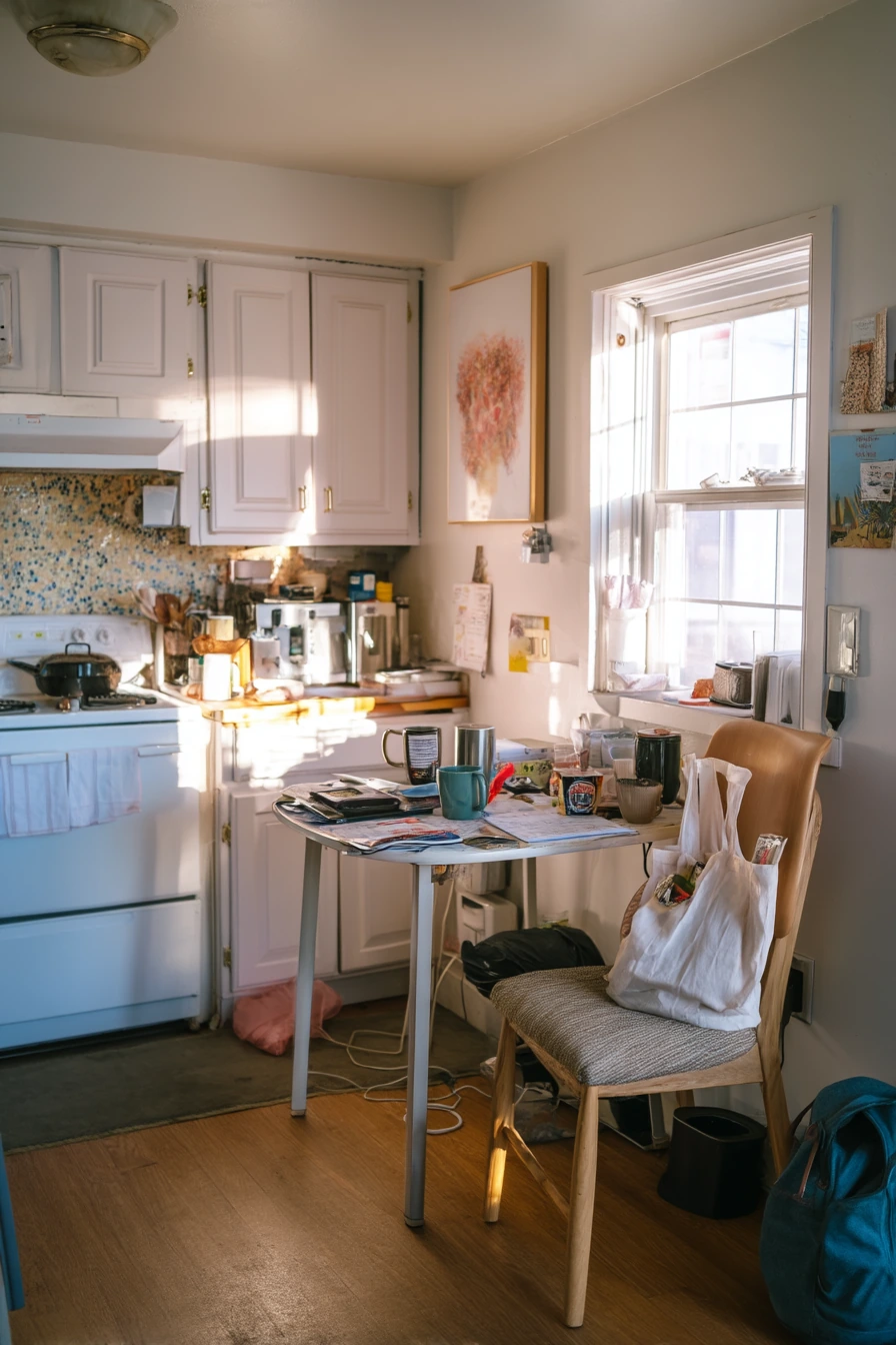

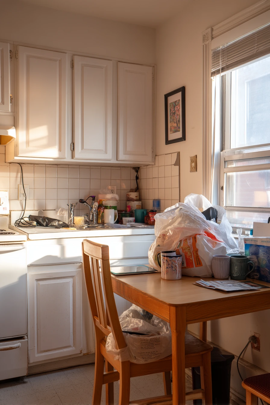
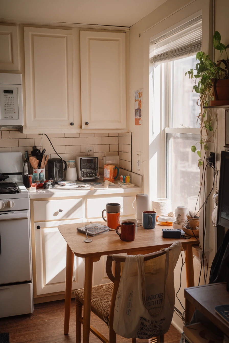
Warm white is one of the best kitchen paint ideas for a small rental because it makes the space feel larger and cleaner without looking stark. In soft afternoon window light, warm white keeps the room airy and welcoming, even when the counters have a mail pile or a few mismatched mugs. It also works with almost any floor color and appliance finish.
If your rental allows it, painted cabinets in the same warm white can create a simple, blended look that hides uneven cabinet styles. Add a peel-and-stick backsplash to bring in pattern and protect the wall behind the sink or stove. A compact table can double as prep space and a place to eat, which is great for tight layouts.
To keep it feeling real and functional, set up one small “drop zone” for daily items. Use a tray or shallow basket for keys and mail so papers do not spread. Hide a charging cable by placing a slim cord cover or running it behind the table leg. A grocery tote on the chair can look casual, but you can also hang it on a hook to free up seating.
- Pick a warm white that is not too yellow so it stays fresh.
- Paint cabinets and walls the same color to reduce visual breaks.
- Add peel-and-stick tile for texture and easy cleaning.
- Use one tray to contain mail, cords, and small items.
- Choose a small round or drop-leaf table to save space.
Pro Design Tip: Use the same warm white on trim and walls in a small kitchen to avoid harsh outlines and make the room feel more open.
Budget Considerations: Peel-and-stick backsplash panels are usually cheaper than tile; buy one extra pack so you can match the pattern if you need a repair later.
Intro H2: 3. Dusty Blue Cottage Kitchen Paint Idea
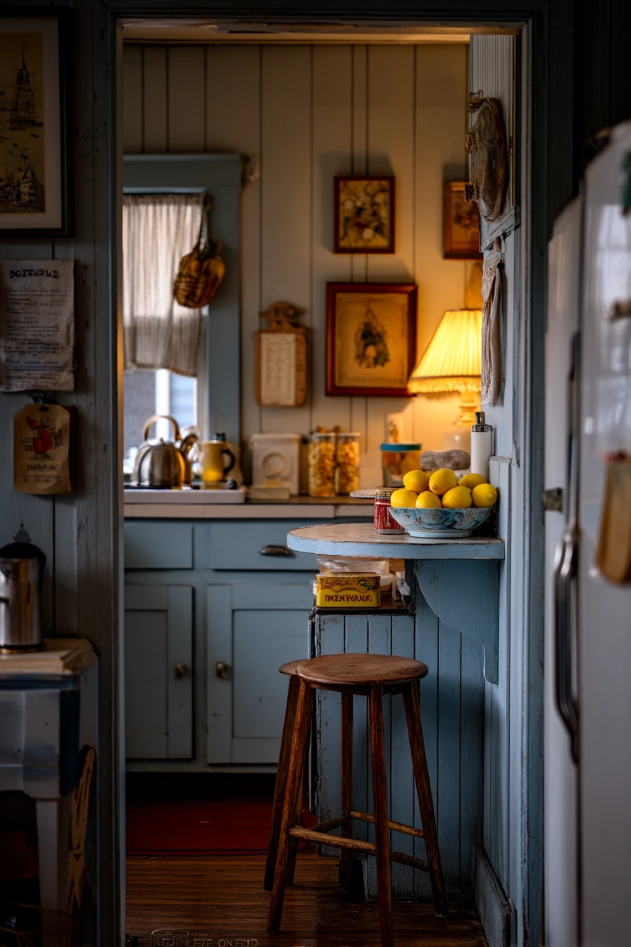
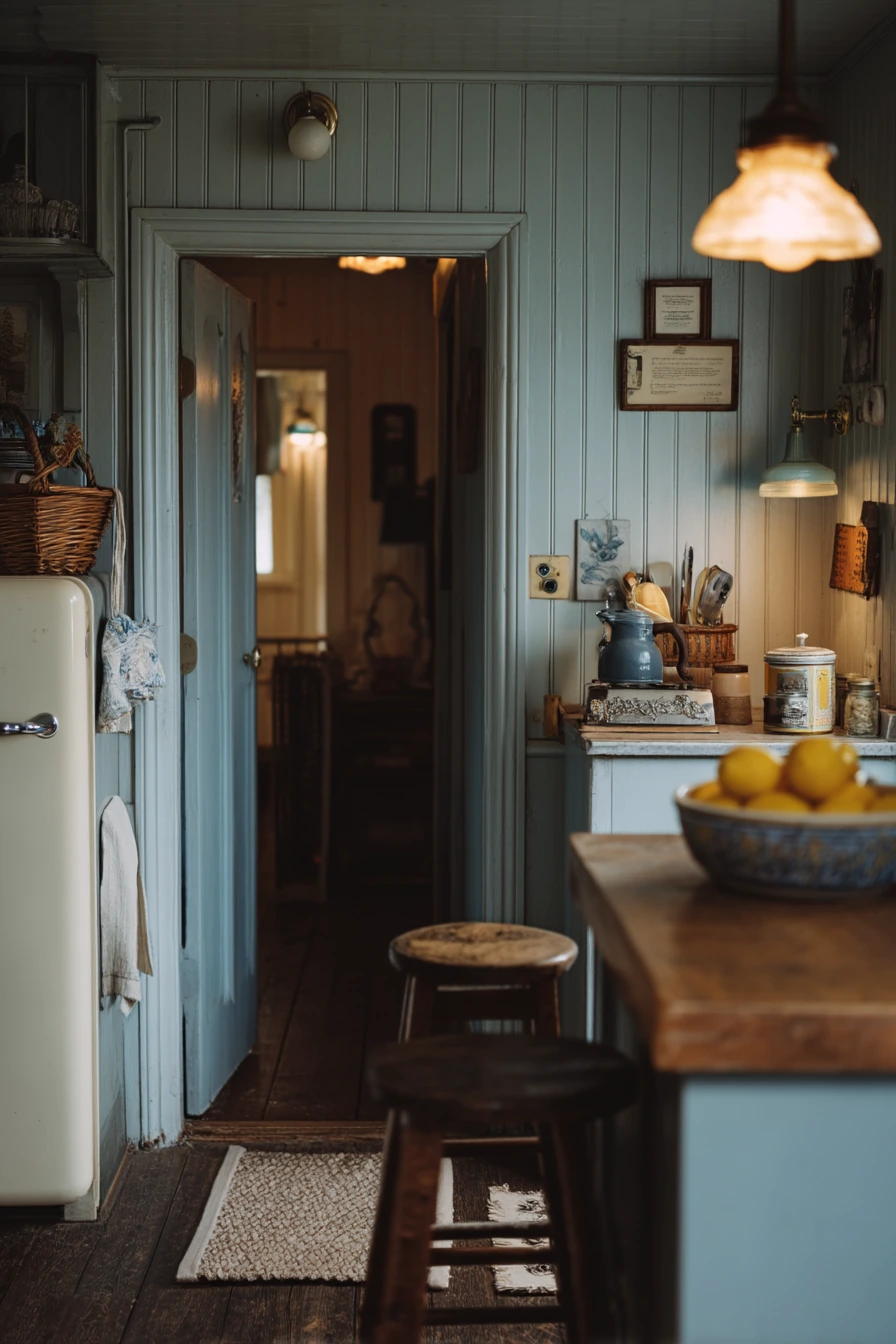
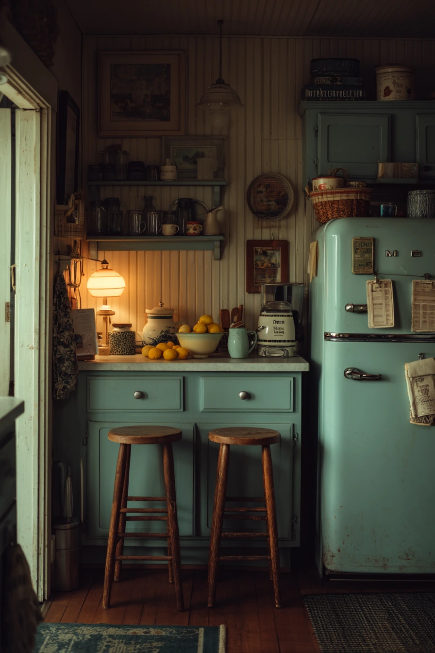
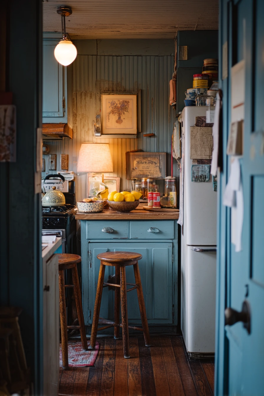
Dusty blue is a cozy cottage kitchen paint color that feels soft, not loud. It works well with beadboard walls because the panel texture adds gentle shadow, making the color look deeper. In a room with warm lamp glow mixed with fading daylight, dusty blue can feel calm and nostalgic, especially when you mix in vintage wood stools and simple, well-used tools.
This color looks best with warm accents. Add an enamel kettle on the stove, a bowl of lemons on the counter, and a folded tea towel in an easy spot. These small items bring in white and yellow, which brighten the blue. If you have pets, a dog treat tin can be part of the look when it matches the cottage style, like metal or enamel.
For a lived-in cottage feel, keep paper items visible but neat. Pin recipe cards beside the fridge or on a small board, instead of letting them spread on the counter. Choose hardware in brushed nickel or antique brass, depending on how warm you want the room to feel. If your kitchen is small, use dusty blue on lower cabinets and keep upper walls lighter to avoid a heavy look.
- Use dusty blue on beadboard to highlight the texture.
- Add warm wood stools to keep the room from feeling cool.
- Style with lemons, white towels, and enamel pieces for contrast.
- Keep recipe cards organized on a pin board near the fridge.
- Choose softer lighting so the blue feels cozy at night.
Pro Design Tip: If you paint beadboard, use a small foam roller first, then a brush in the grooves, so the finish looks smooth and even.
Budget Considerations: Beadboard can be pricey; you can get a similar look with beadboard wallpaper or paintable panels on one feature wall.
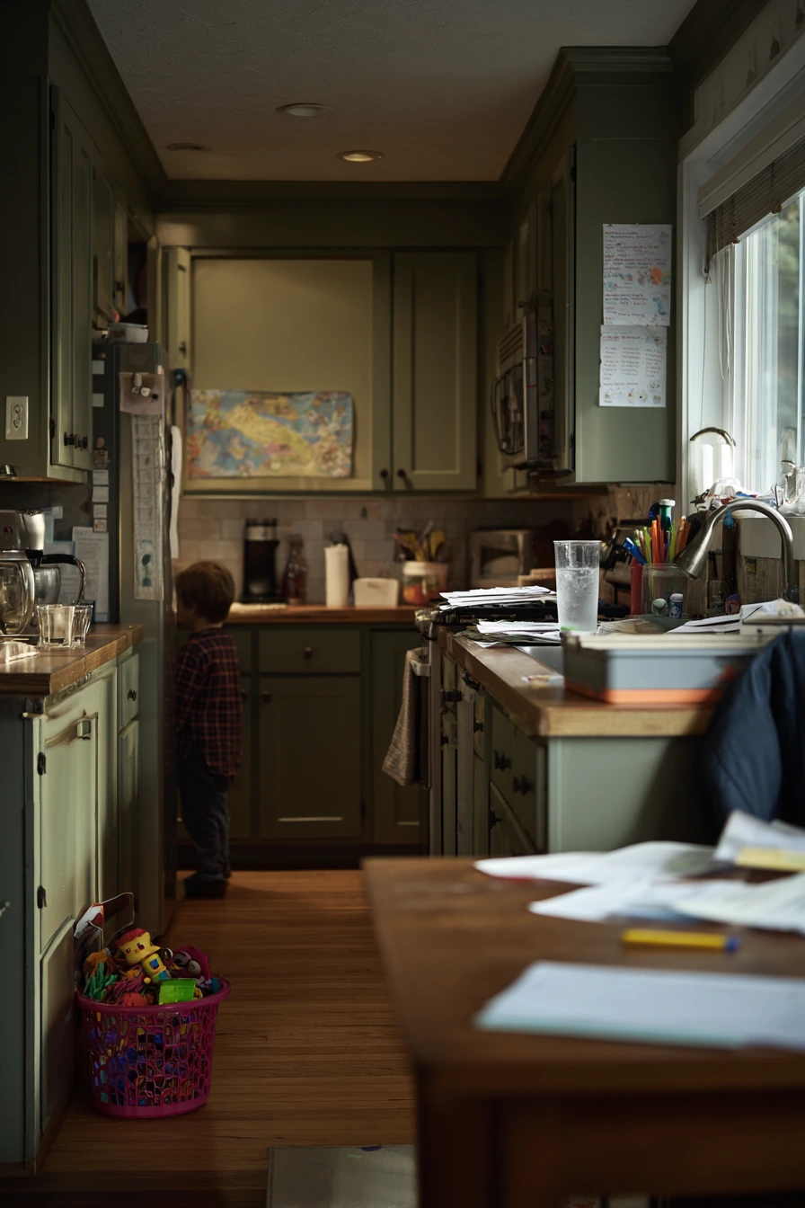
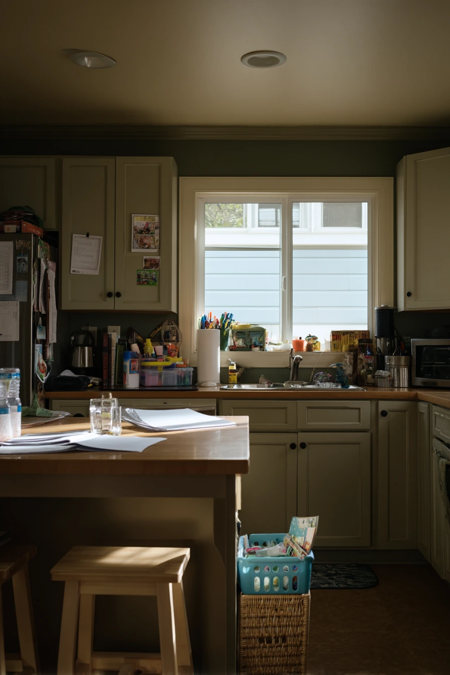
Intro H2: 4. Deep Olive Kitchen Paint for Busy Family Life
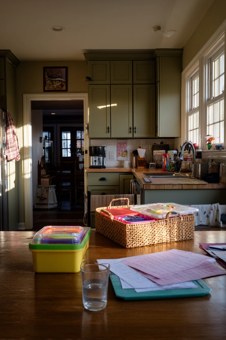
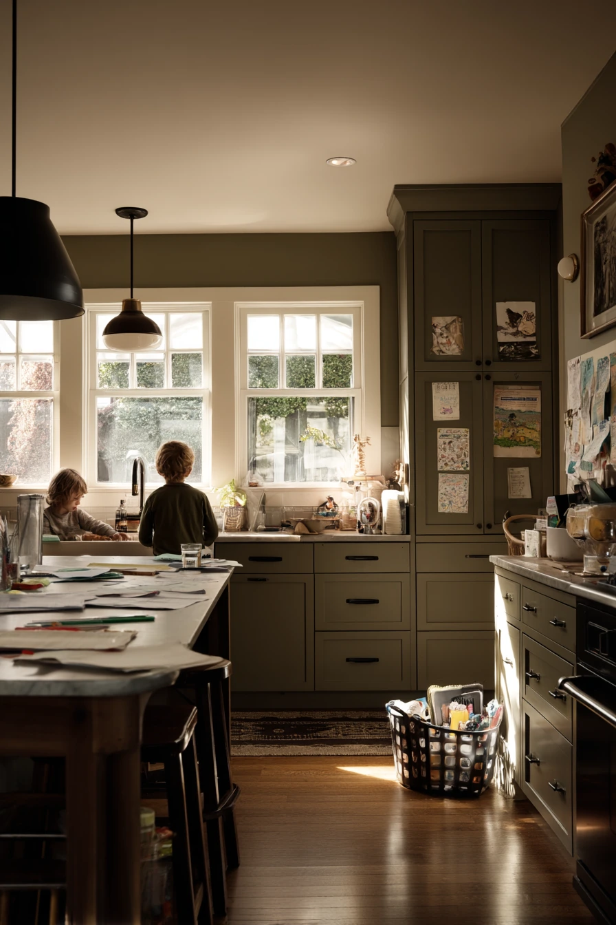
Deep olive is a grounded kitchen paint idea that fits a busy family space. It hides scuffs better than light colors and still feels warm and earthy. In late-day window light, olive can look rich and steady, which is helpful in a kitchen that is always in use. It also pairs well with simple flat-front cabinets, so the room looks clean even when life is not.
To style deep olive, use matte black hardware for a clear, modern contrast. Keep counters practical and real, with a spot for school papers, lunchbox lids, and a half-full water glass. The key is giving each category a home. Add a slim file tray for papers and a small bin for lunch items. A toy basket tucked near the island can match the room if you pick a natural material like woven seagrass.
Since olive is darker, balance it with lighter surfaces. White or light stone counters, a pale backsplash, and warm wood accents help. If you are painting walls, keep cabinets lighter to avoid a closed-in feel. If you are painting cabinets olive, consider lighter walls and a bright ceiling. Use under-cabinet lighting so prep areas stay bright.
- Pair deep olive paint with matte black pulls and knobs for a simple look.
- Use a file tray or wall pocket to control school papers.
- Store lunchbox parts in one bin so they are easy to grab.
- Add a woven toy basket to keep the island area clear.
- Balance the darker color with light counters and good task lighting.
Pro Design Tip: Choose an olive with a bit of gray in it if your kitchen gets strong sun; it will stay steady and not look too yellow.
Budget Considerations: Swap hardware first; matte black knobs and pulls are a low-cost change that makes olive paint look more intentional.
Intro H2: 5. Butter Yellow Breakfast Nook Paint Idea
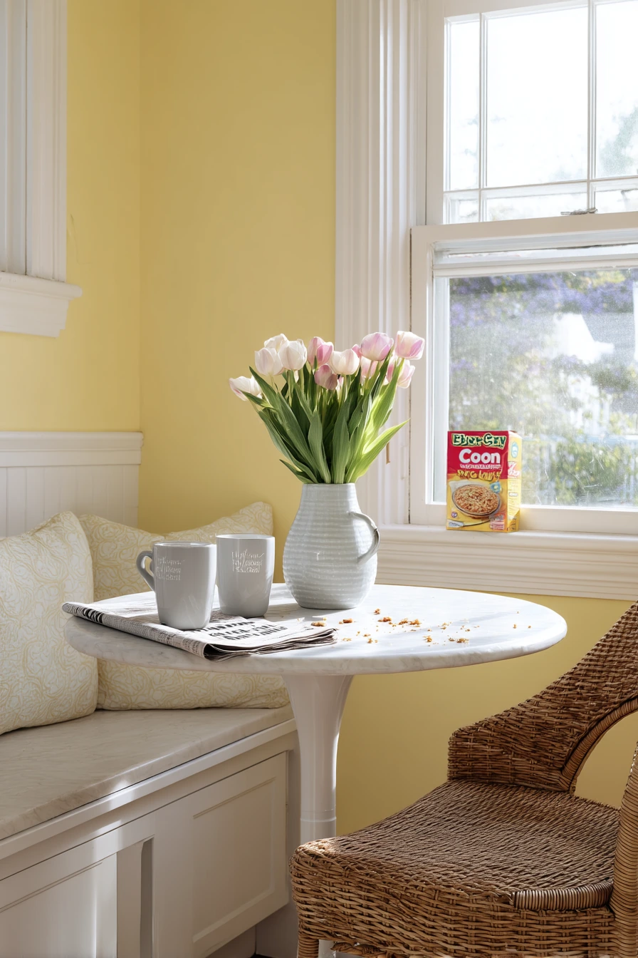
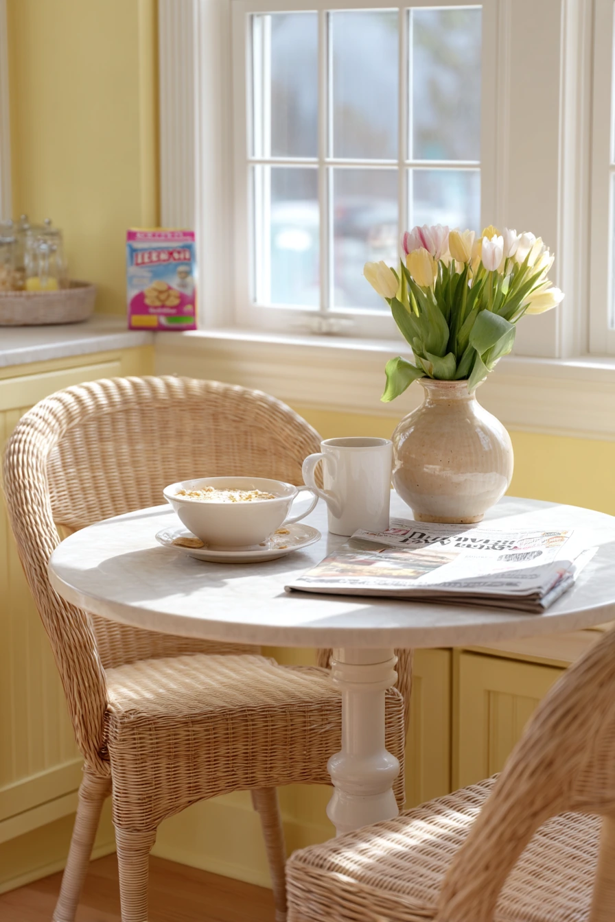
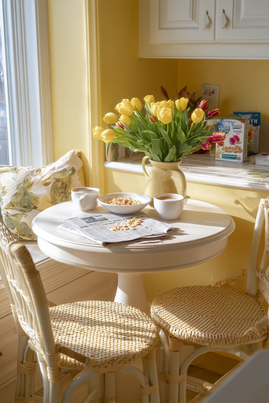
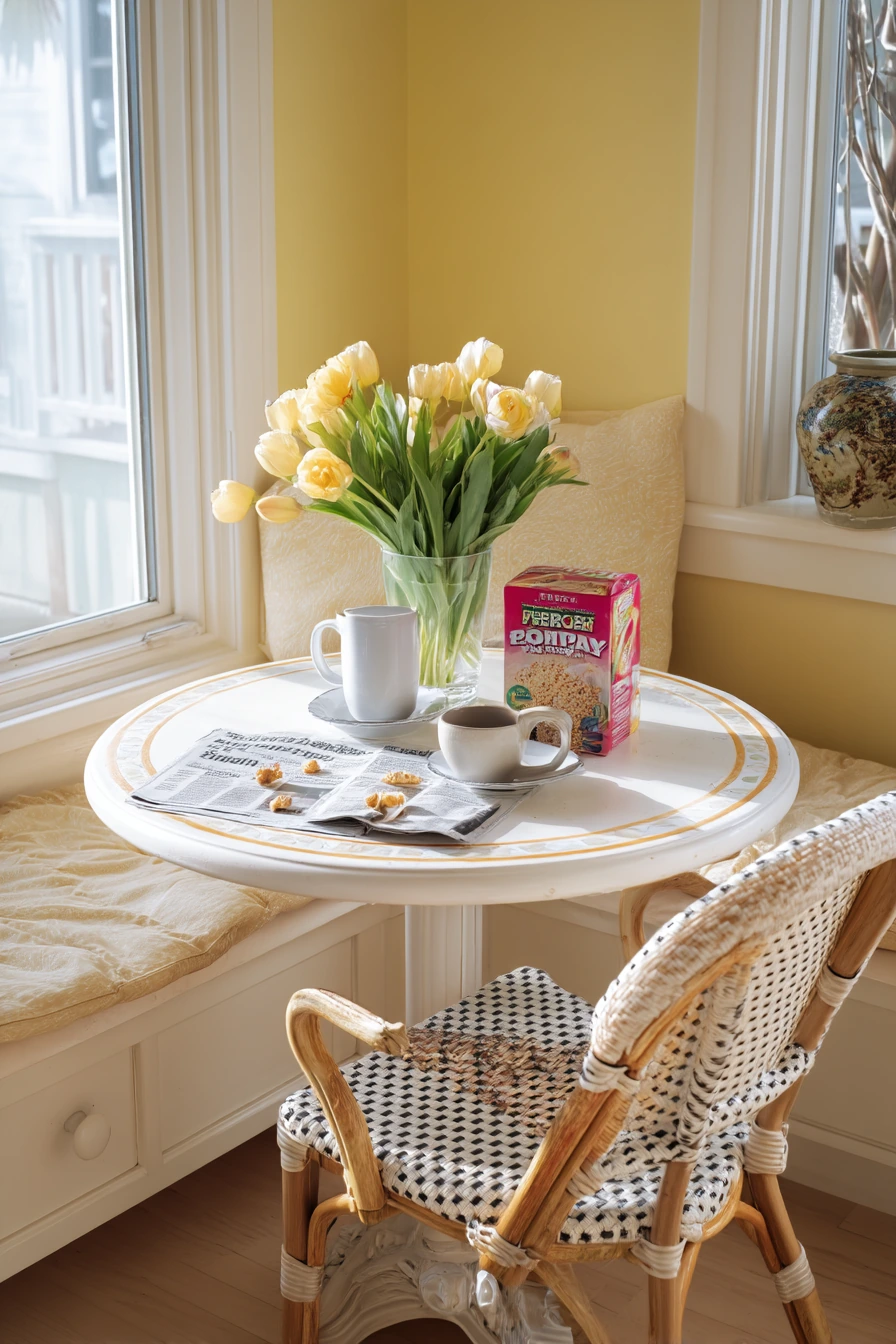
Butter yellow is a cheerful kitchen paint choice that still feels soft. It works especially well in a breakfast nook with white trim, where the contrast keeps the yellow looking crisp. In soft morning sun, this color can make the space feel bright even on weekdays. It is also a nice option if your kitchen does not get a lot of natural light.
Style butter yellow with simple, cozy pieces. A round bistro table keeps traffic moving and makes the nook feel friendly. Add woven chair cushions for texture and comfort. A ceramic vase of tulips brings in a fresh spring feel, but you can switch to eucalyptus or dried stems in colder months. Leave room for real life, like a cereal box on the counter, a newspaper folded beside coffee mugs, and a few crumbs on a placemat.
Because yellow can shift a lot in different bulbs, your lighting matters. Choose warm white bulbs to avoid a green cast. If you want a quieter look, use butter yellow on the nook wall only and keep the main kitchen a neutral shade. Add a washable paint finish near eating spots so you can wipe splashes and fingerprints.
- Pair butter yellow walls with bright white trim for a clean outline.
- Use a round table to make a small nook feel easier to use.
- Add woven cushions and one linen placemat for texture.
- Style with tulips or simple greens to keep it fresh.
- Use warm bulbs so the yellow stays soft and not sharp.
Pro Design Tip: Test butter yellow next to your trim color; the wrong white can make the yellow look dull or muddy.
Budget Considerations: If painting the whole kitchen feels costly, paint only the breakfast nook wall and update the rest with new seat cushions and a simple vase.
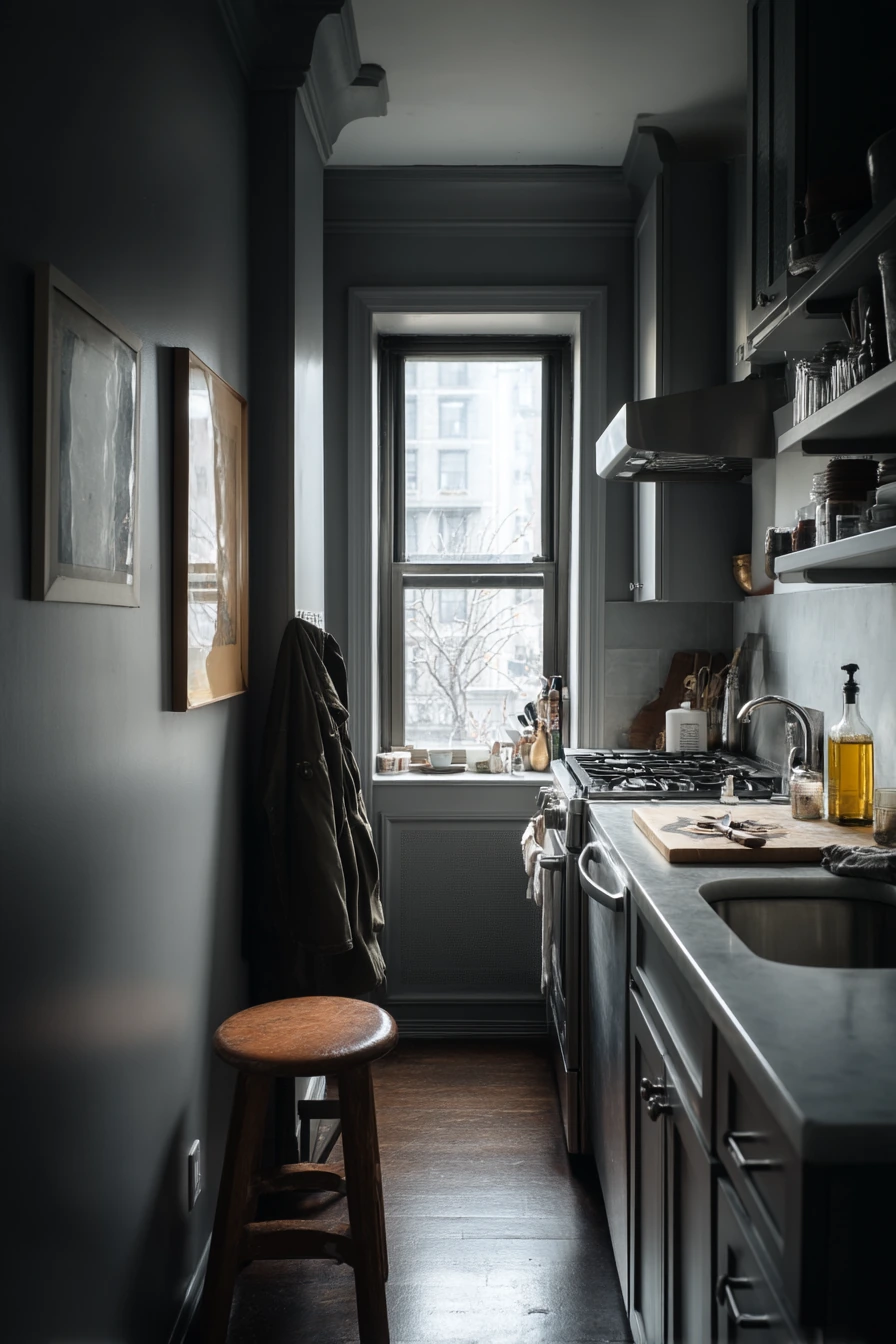
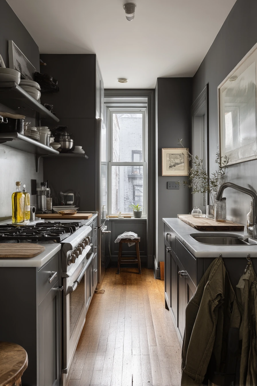
Intro H2: 6. Charcoal Gray Galley Kitchen Paint Idea
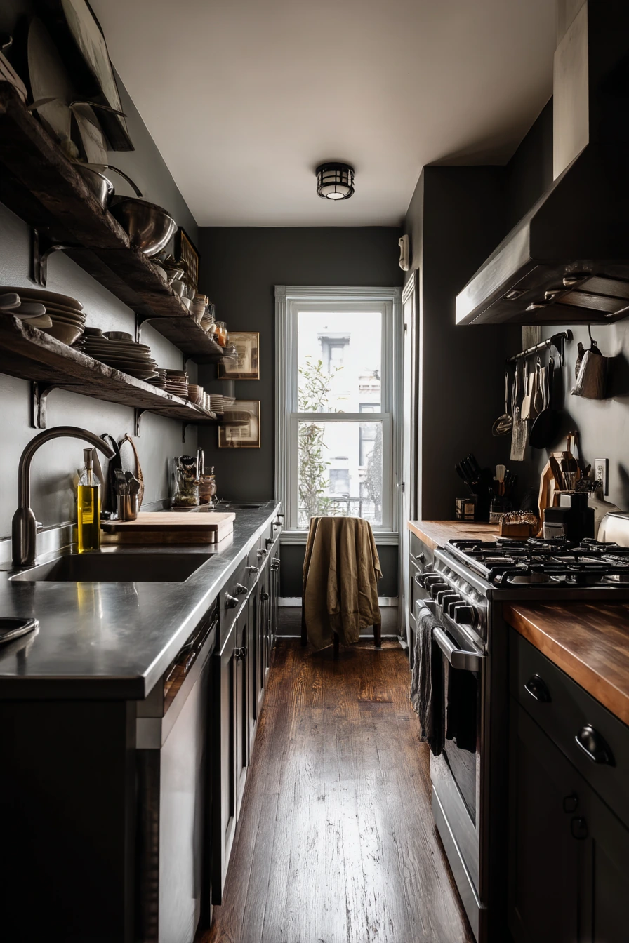
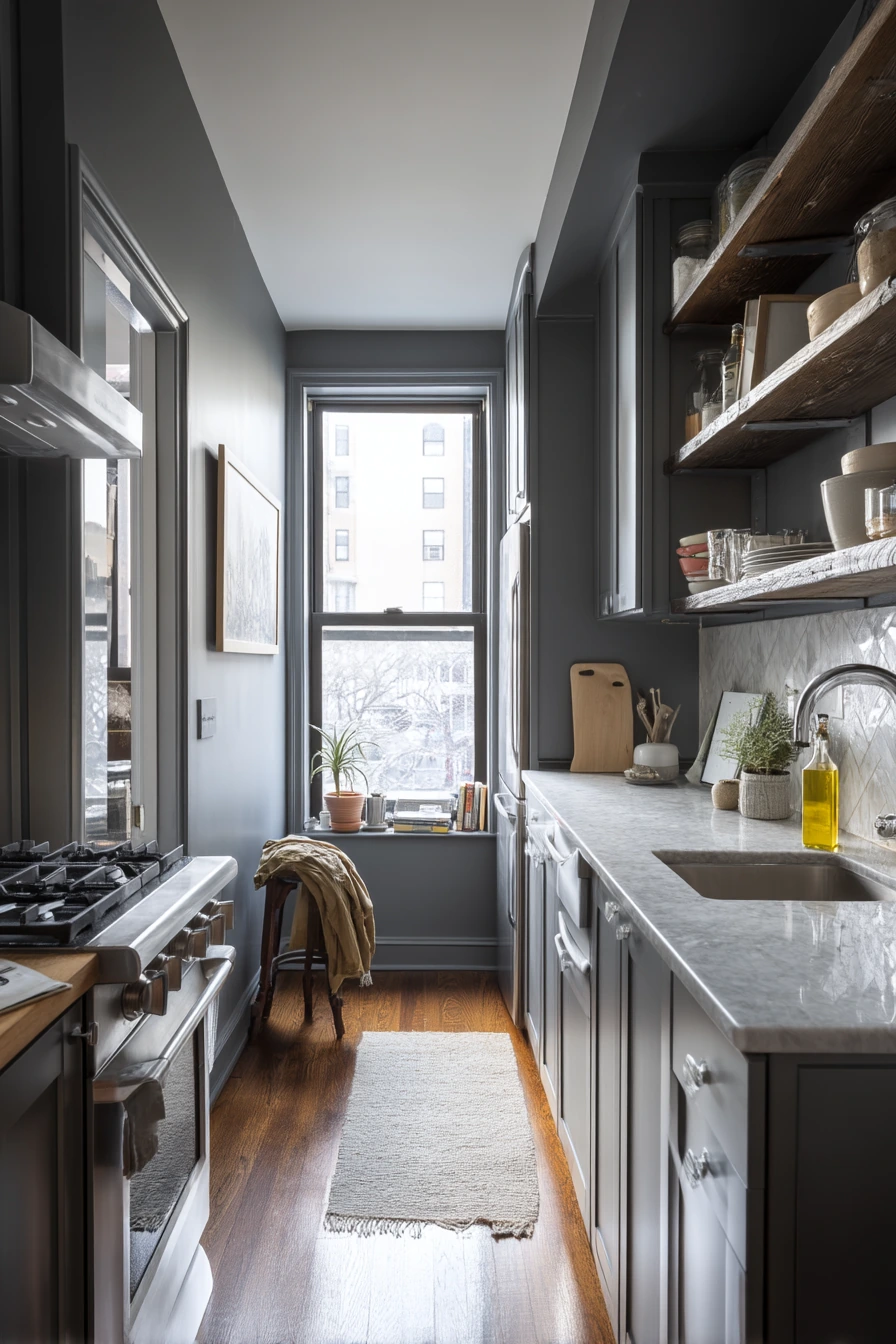
Charcoal gray is a strong kitchen paint idea for a narrow galley because it can make the space feel polished and intentional. It works well with clean lines, stainless appliances, and slim open shelves. In soft overcast daylight, charcoal looks smooth and modern, not harsh, especially when you keep the rest of the materials simple.
To make this color work in a tight layout, focus on function. Keep one cutting board propped by the stove, and place a single olive oil bottle nearby for cooking. Near the sink, a dish soap ring or tray keeps the counter from looking messy. A jacket tossed over a stool is real life, but adding one wall hook or a slim coat rail can keep the walkway clear.
Charcoal gray can feel heavy if the room has poor lighting. Add under-shelf lights or bright ceiling lighting to keep prep areas safe. Choose a paint with a durable finish, like satin on cabinets or eggshell on walls. Pair charcoal with lighter counters, a white backsplash, or warm wood details so the room does not feel too dark.
- Use charcoal gray on lower cabinets to ground a narrow space.
- Keep open shelves slim and style them with only a few daily items.
- Add a small soap tray to control sink-area drips and rings.
- Use stainless and black accents for a clean, modern mix.
- Install hooks so jackets and bags do not block the galley path.
Pro Design Tip: In a galley, paint the far end wall charcoal and keep side walls lighter to add depth and make the room feel longer.
Budget Considerations: If you cannot change counters, use lighter accessories like a pale runner and light canisters to balance the dark paint.
Intro H2: 7. Blush Pink Kitchen Paint with Oak Accents
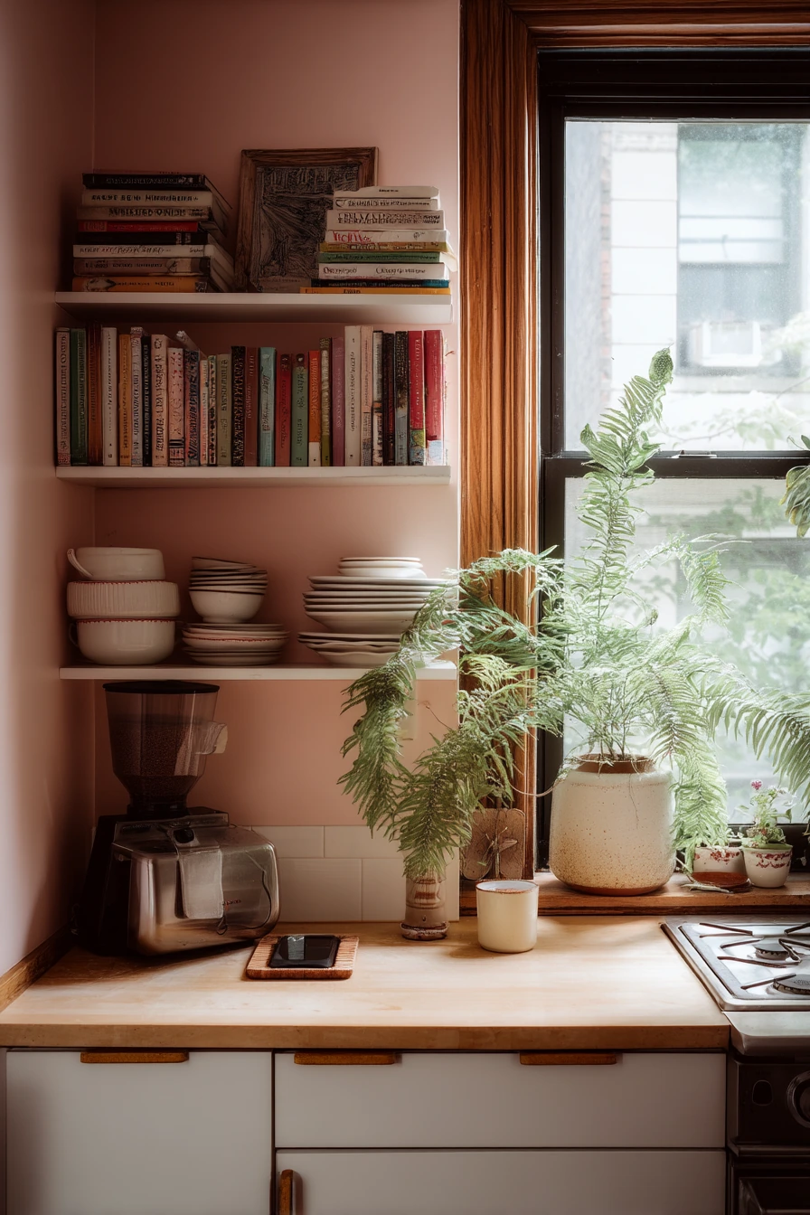
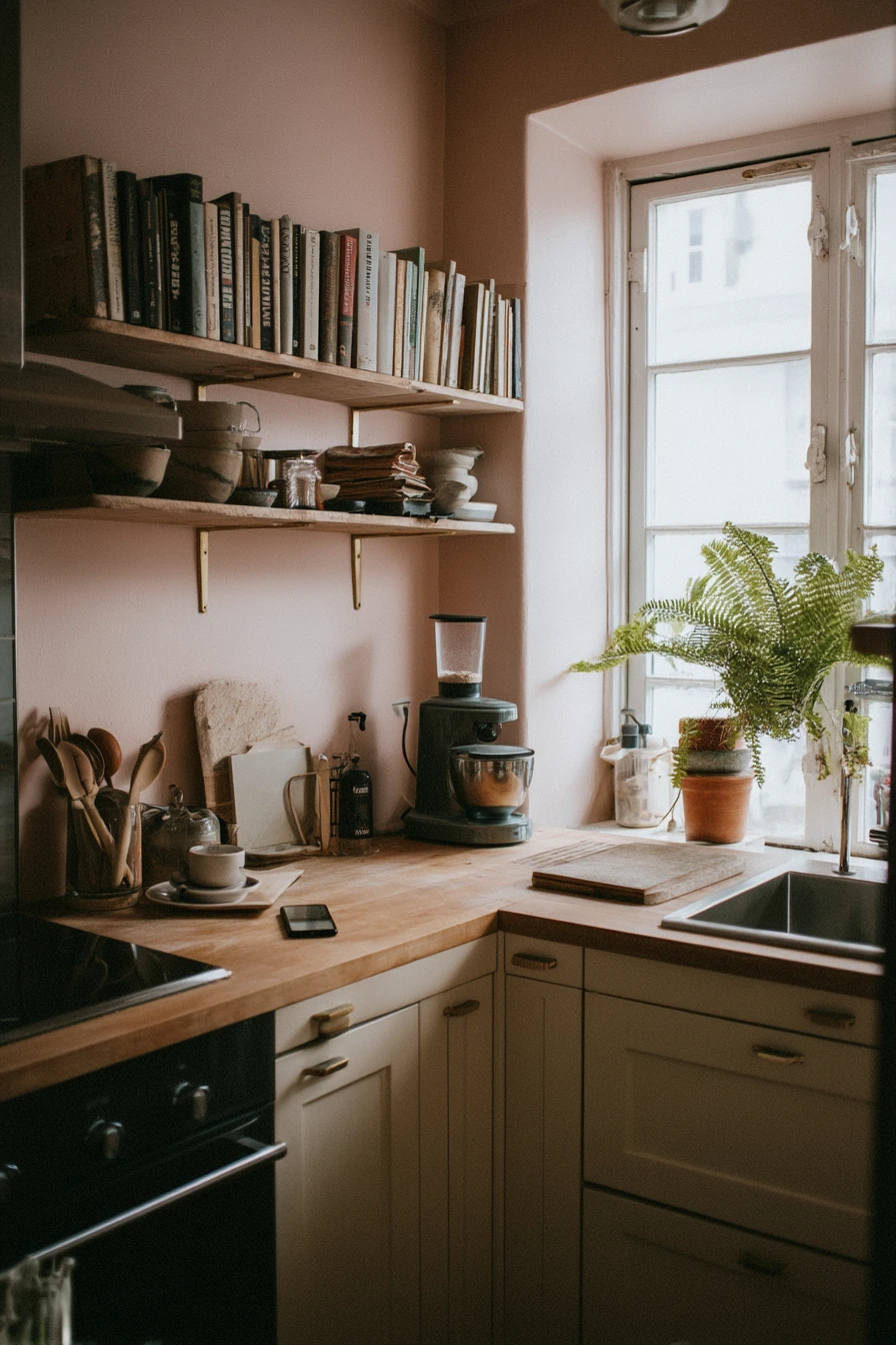
Blush paint is a soft kitchen color that can feel fresh and modern when it is paired with oak accents. It works well in a compact apartment kitchen because it adds warmth without making the room feel smaller. With gentle window light, blush looks calm and clean, not bright or childish, especially when the rest of the palette stays simple.
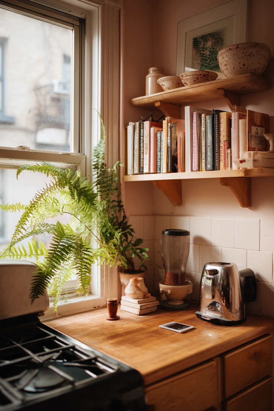
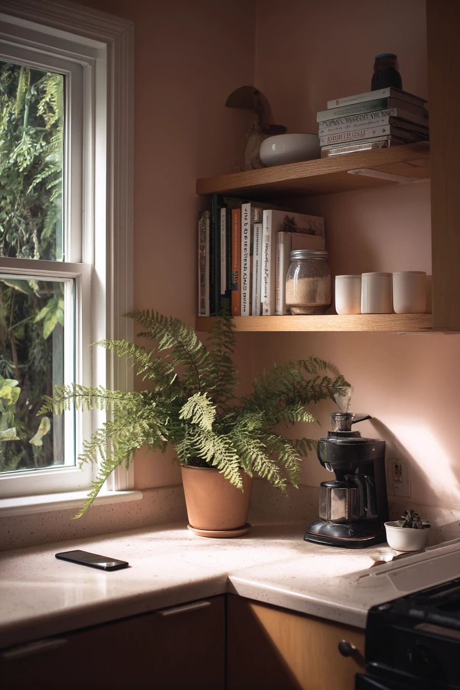
To style blush, use floating shelves and keep them practical. Stack a few cookbooks, add a coffee grinder, and leave some breathing room so it does not look crowded. A phone charging on the counter is normal, so manage it with a small tray or a charging station tucked near an outlet. Add one potted fern leaning toward the window for a natural green note that helps blush feel balanced.
For finishes, choose a durable wall paint that can handle splashes. If you paint cabinets blush, consider a slightly deeper blush on the island or lower cabinets to add depth. Use hardware in brushed brass, matte black, or warm nickel, depending on your oak tone. Keep the countertop clear with one or two items so the color stays the star.
- Pair blush walls with oak shelves or stools for a warm, natural mix.
- Limit shelf decor to everyday items like cookbooks and mugs.
- Use a small tray to keep chargers and cords under control.
- Add one green plant to balance the pink tone.
- Choose simple hardware to keep the look adult and clean.
Pro Design Tip: Pick a blush with a muted, dusty undertone; it will look more modern and will not fight with food colors on the counter.
Budget Considerations: Keep existing cabinets and paint only the walls blush; add oak with peel-and-stick wood look shelf liners or a small oak cutting board.
Intro H2: 8. Soft Beige Neutral Kitchen Paint for a Calm Look

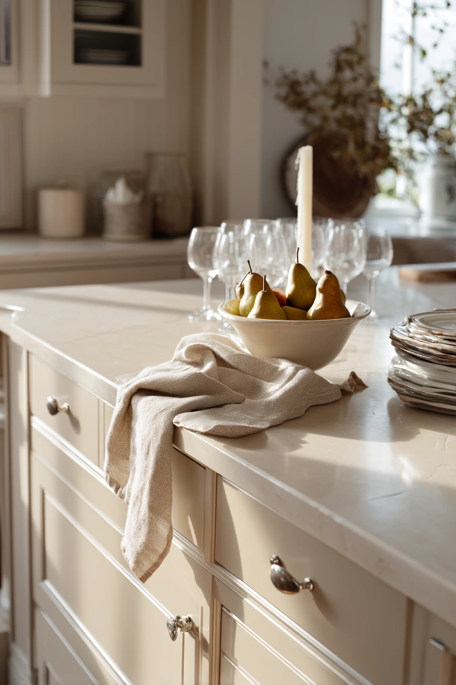
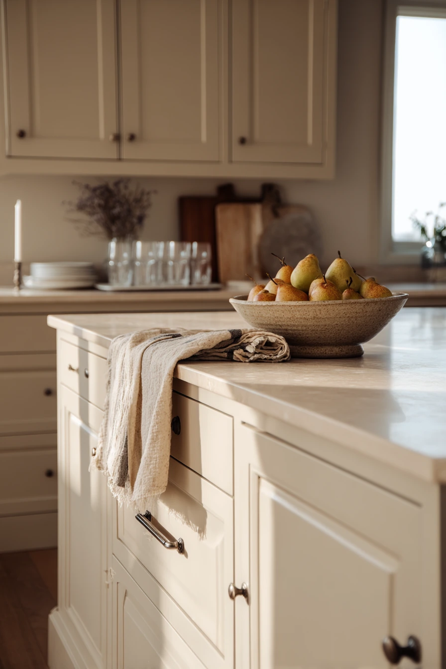
Soft beige is a classic kitchen paint idea when you want a creamy neutral that feels calm and refined. It works well for entertaining because it makes food, wood, and glassware look good without competing for attention. In warm late-afternoon light, beige can feel cozy and quietly elegant instead of plain.
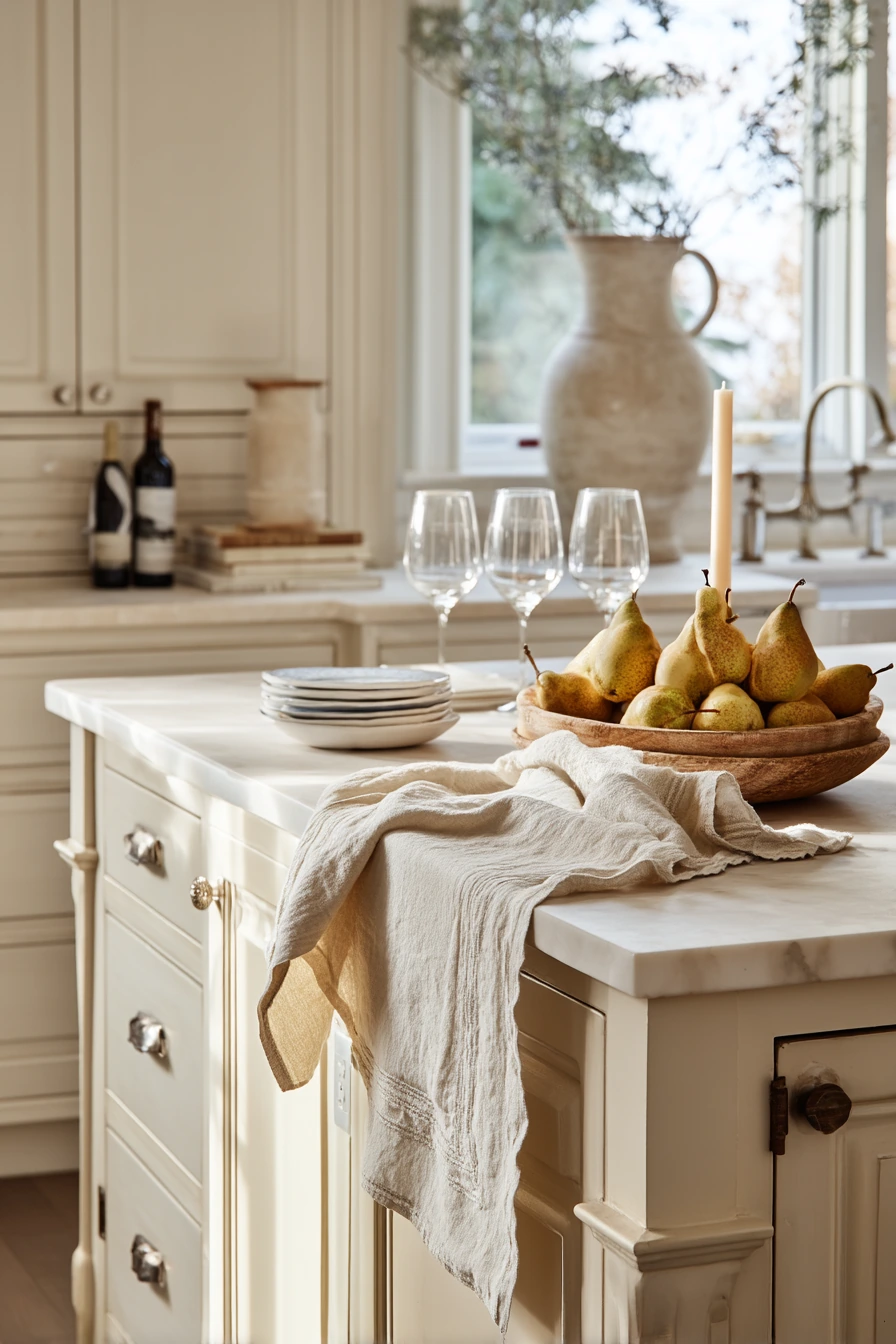
Style this look with simple, natural details. On the island, place a bowl of pears for a soft green accent. Add a linen runner to bring in texture, and let wine glasses dry on the rack as a real-life detail. A candle stub and napkins half-folded can make the kitchen feel like it is ready for guests but still relaxed. A dish towel slung over a drawer pull keeps it practical.
Beige can change a lot depending on undertones. If your floors are warm, choose a beige with a little gray so it does not turn too yellow. If your counters are cool, choose a beige with a soft warm base so the room does not feel flat. Use a washable paint finish near cooking zones, and keep the trim a clean white or a slightly warmer white for a softer edge.
- Use soft beige on walls to create a smooth background for wood and stone.
- Style the island with one fruit bowl and a linen runner.
- Keep glassware visible for a simple, welcoming feel.
- Add small details like napkins and a towel for an easy lived-in look.
- Choose the right undertone so beige does not look yellow or gray.
Pro Design Tip: Match beige to your fixed finishes first, like countertop and floor, then choose the trim white so the whole palette feels tied together.
Budget Considerations: Neutral paint is usually the cheapest upgrade; spend a little more on good brushes and rollers so the finish looks smooth and even.
Intro H2: 9. Terracotta Kitchen Paint for an Earthy Creative Space
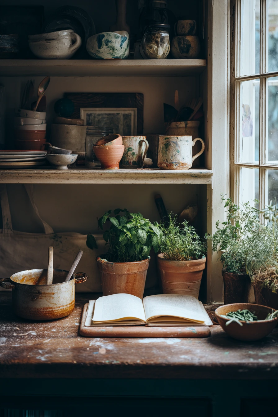
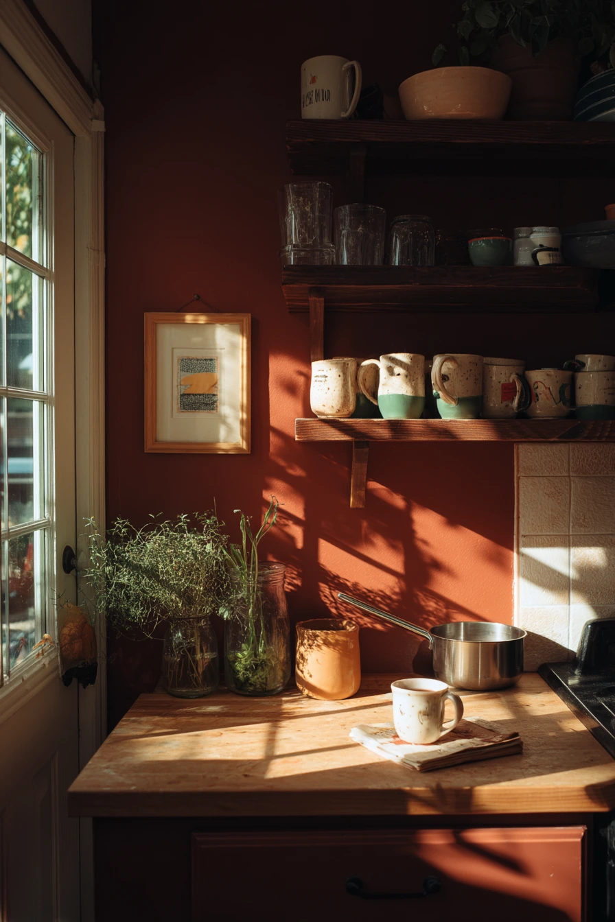
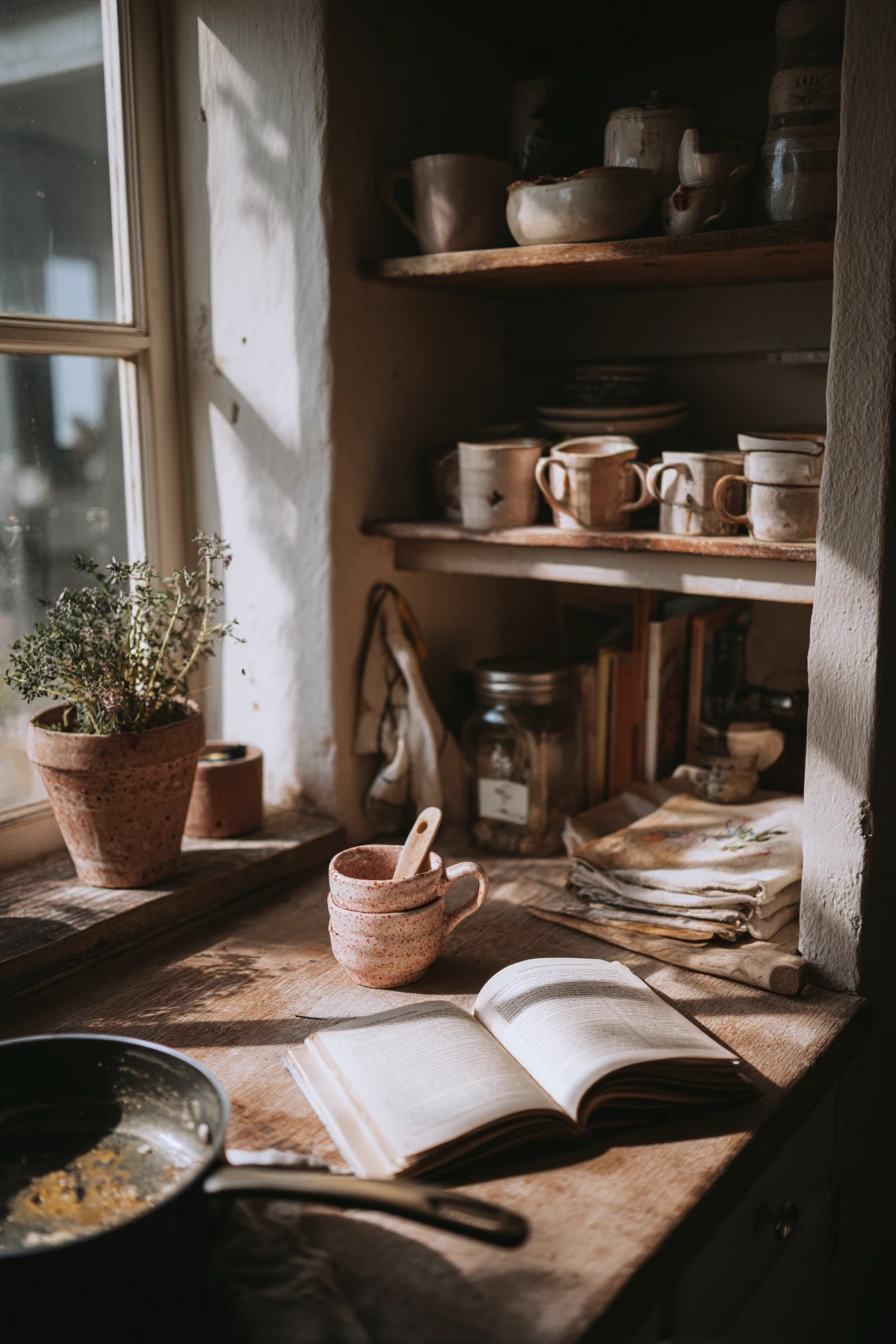
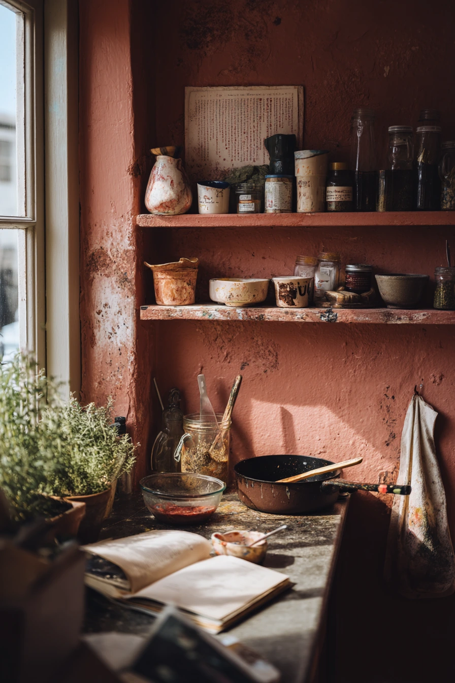
Terracotta is an earthy kitchen paint idea that feels warm, creative, and personal. It works well in a small artist’s kitchen because it adds color without needing a lot of decor. With window light and soft shadows, terracotta can look rich and grounded, especially when you mix it with open pantry shelves and handmade mugs.
To style terracotta in a real way, lean into useful items. Keep fresh herbs in a glass jar near the sink or stove for a pop of green. Leave a recipe book open to a page you are using and let a spoon rest in a saucepan while you cook. A paint-splattered tote near the door fits the story of the home, but you can hang it on a hook so it feels intentional.
Terracotta pairs well with off-white, cream, and natural wood. If you have a lot of wood cabinets, terracotta on the walls can add warmth without clashing. If you have white cabinets, terracotta can become the main color statement. Use warm bulbs to keep the paint from looking too brown. If you worry about the room feeling dark, use terracotta on one wall and keep the others light.
- Use terracotta paint on walls to warm up a small kitchen fast.
- Style open shelves with handmade mugs and simple bowls.
- Add herbs in glass jars for a fresh, easy accent.
- Use hooks for totes and aprons to keep clutter off chairs.
- Pair with cream and light wood so the color feels balanced.
Pro Design Tip: Choose a terracotta with a hint of pink if your kitchen has cool light; it will keep the color from looking flat or muddy.
Budget Considerations: If open shelving is expensive, remove only one cabinet door for a trial “open shelf” look, or add one basic shelf over a clear wall.
Intro H2: 10. Pale Green Kitchen Paint for a Bright Weekend Reset
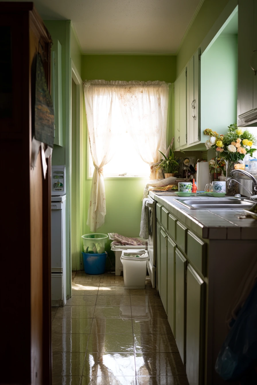
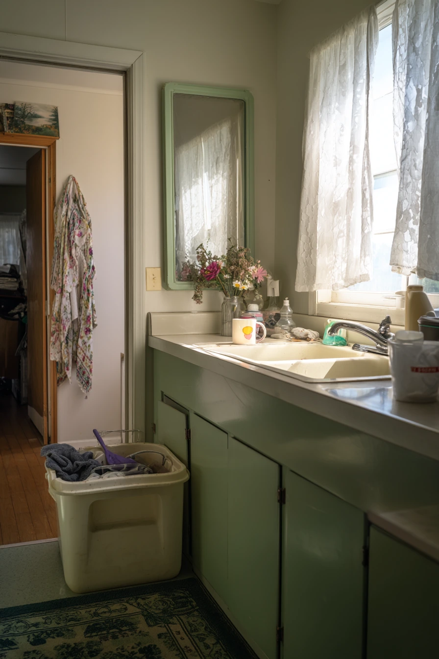
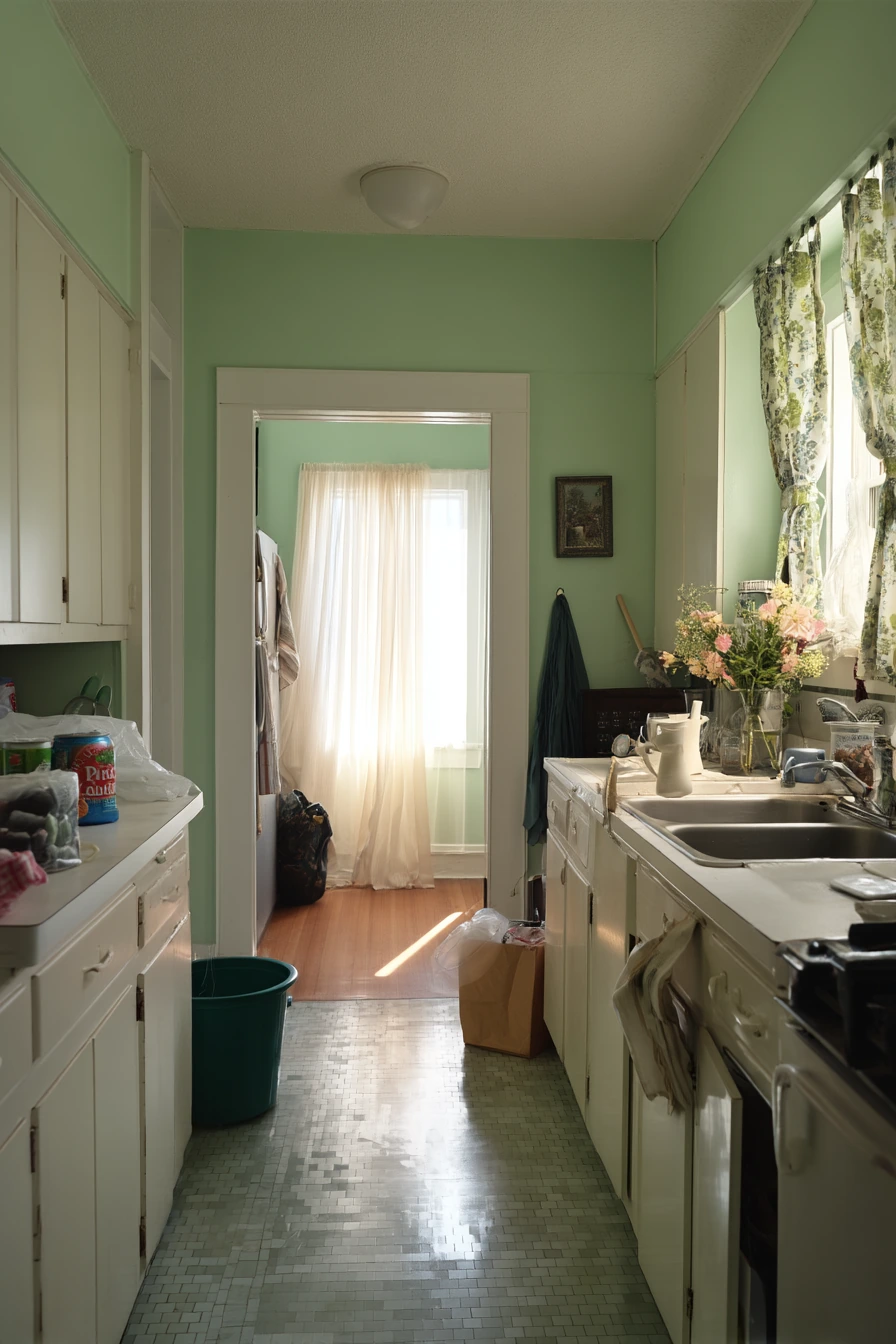
Pale green is a clean kitchen paint idea that feels light, crisp, and restorative. It is a good choice when you want the kitchen to feel fresh after a busy week. In cool morning light, pale green looks airy and calm, especially when the sink is cleared of dishes and the window is open with curtains moving.
To style this color, keep surfaces simple and add a few “reset” cues. Fresh flowers on the counter bring quick color. A tea mug can stay out without looking messy if the rest of the counter is clear. If you see a folded laundry basket in the hallway reflection or a mop bucket near the pantry, that is real life. The goal is to make the room feel organized, not perfect.
Pale green works with white cabinets, light wood, and stainless appliances. Choose a paint finish that can handle cleaning, especially near the pantry and sink. If you want a little more contrast, add black or brushed brass hardware. For styling, use clear jars and light linens so the space stays bright. Keep one small tray for daily items to stop clutter from spreading back in.
- Use pale green on walls for a light, clean color that still has warmth.
- Open the window and use simple curtains to keep the look soft.
- Style with fresh flowers and one mug for a relaxed reset feel.
- Use trays and clear containers to keep counters tidy.
- Add small contrast with black or brass hardware if the room feels too plain.
Pro Design Tip: Pale green looks best when you add one warm element, like wood stools or a tan runner, so it does not feel chilly in the morning.
Budget Considerations: A weekend reset can be low cost; repaint one wall, add a new washable runner, and swap to matching storage bins instead of doing a full remodel.

Good kitchen paint ideas start with real life, not a perfect photo. Pick a color that matches your light, your finishes, and how you use the room every day.
If you want calm, try soft sage, dusty blue, or beige. If you want bold, deep olive, charcoal, or terracotta can add depth without needing a full renovation.
FAQ
What is the best paint finish for a kitchen? Satin or eggshell works well for most walls because it is easier to wipe. For cabinets, a durable enamel in satin or semi-gloss is common.
Should I paint kitchen walls or cabinets first? If you want the biggest change, paint cabinets. If you want a faster update, paint the walls first and see if you still want to change cabinets later.
How do I choose paint color with my counters? Match the undertone. Warm counters often look best with warm whites, beige, terracotta, or butter yellow. Cool counters often pair well with sage, pale green, dusty blue, or charcoal.
Do dark colors make a kitchen feel smaller? They can, but good lighting and light counters help. Deep olive and charcoal can look great in small spaces when you balance them with bright surfaces.
What colors hide kitchen mess best? Mid-tone shades like sage, dusty blue, and olive hide marks better than bright white. Matte finishes can show fingerprints, so choose a washable sheen.
How can I update a rental kitchen with paint? If painting is allowed, warm white is a safe choice. Add peel-and-stick backsplash, change hardware if permitted, and use trays to manage clutter.
How many paint samples should I test? At least two to three. Paint large swatches on different walls and check them in morning, afternoon, and night light.
Save your favorite color idea, then start with one small change like paint, hardware, or open shelving. Small updates can make your kitchen feel new.